PROJECT OVERVIEW
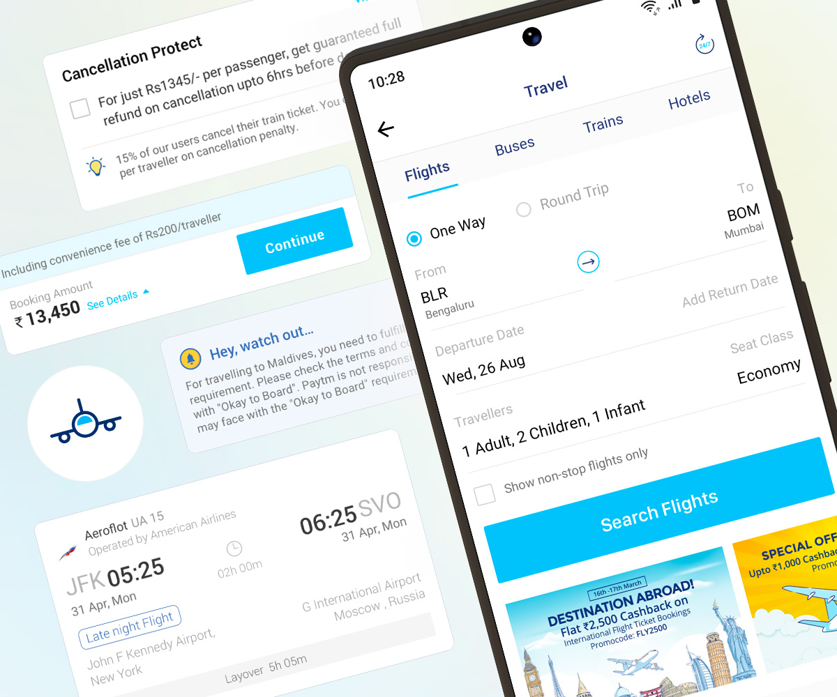
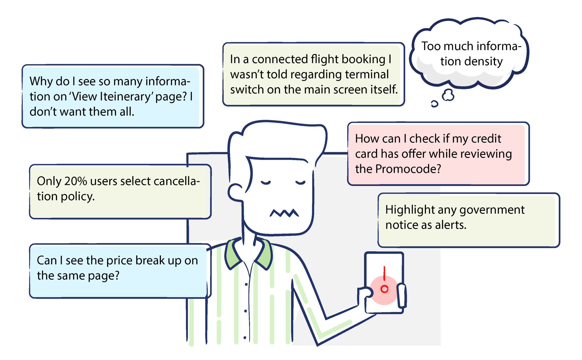
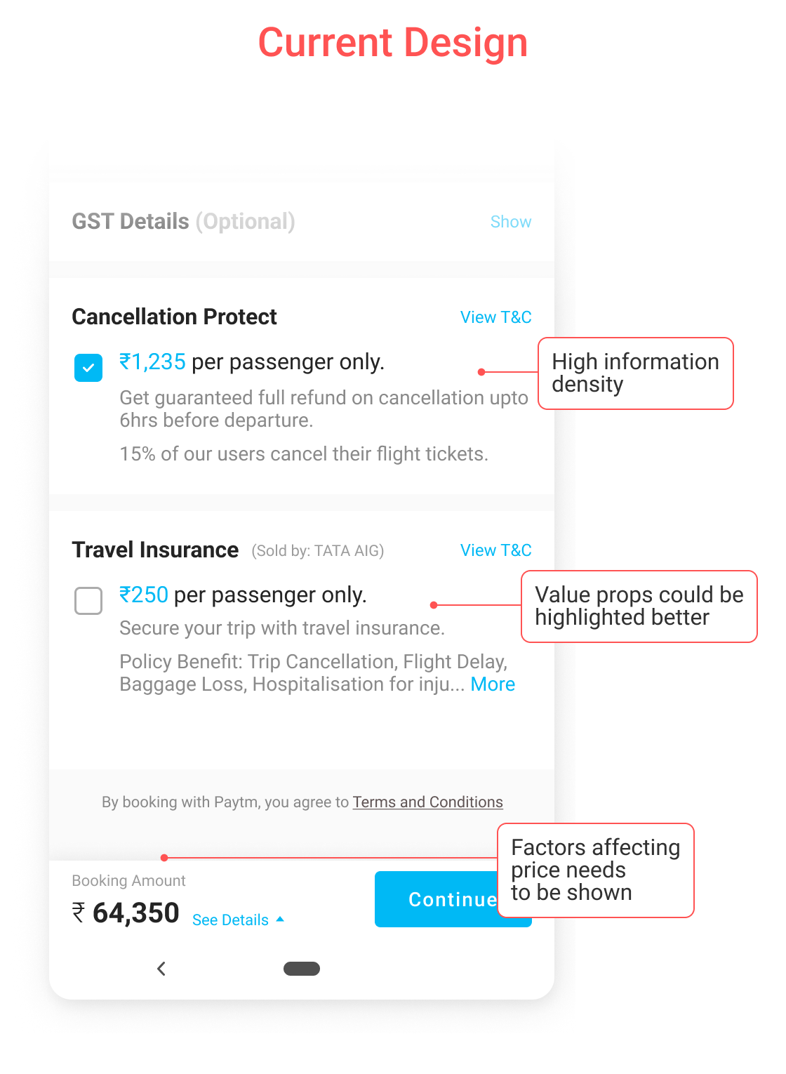
The objective of this project was to redesign the ‘Review Itinerary’ and ‘Traveller’s Details’ sections within the Paytm Mobile application’s flight booking system. This comprehensive overhaul required a thorough understanding of key user journey, booking patterns, interaction behaviour, and user psychology.
The project involved categorising all flight -related information into manageable, bite-sized information to prevent users from feeling overwhelmed. Additionally, the new user interface (UI) must be designed to minimize cognitive load and ensure a seamless, intuitive user experience.
In 2017 Paytm had over 350 million active users transacting via wallet, making it India’s largest fintech company with 65% total market share.
More than 90% of flights booking on Paytm was made via mobile app making it a go to app for any travel related bookings.
Every quarter, our UX team would get insights from research team which would help us to prioritise the work item for remaining semester. My scope of work would fall under “Review itinerary” and “Traveller’s info” experience. I would analyse all data related to user feedback, interaction pattern and decision making patterns to kick start my design solutions.
Here is an overview of critical user pain points I shortlisted for second semester of 2017.
On top of all these user problems. We also had significant ask from our business team. These changes are made in accordance of company’s plan for future, any new feature incorporation request or Senior Leadership feedbacks in general.
Business Ask
• 7-11% of flight tickets booked through Paytm are cancelled or rescheduled. But only 22% of those have ‘Cancellation Protect’.
• Redesign “Cancellation Protect” section. Educate users and upsell those values to increase this number.
To keep the information density minimum and provide more flexibility to user, we segregated ‘Traveller’s Information’ to another sub stage.
Here is how all the classes looked like after design refresh:
Flight Cards
New flight card layout to emphasise primary data.
Played with different visual elements like font weight, colour, spacing and strokes to create hierarchy and distribution within elements.
Quick Alerts
Our user research told us that alerts should be realtime. It should be shown while selecting an option right at the time, instead of showing at the checkout stage.
We heard our user’s sentiments and redesigned the flow to cater this need.
Policy, Insurance & Offers
Policies can often be lengthy, text-heavy, and cumbersome, occupying significant screen space. However, they cannot be overlooked or relegated to a ‘more details’ section, as presenting basic information upfront is essential for users to make informed decisions.
Our research indicates that users primarily seek three key pieces of information in cancellation and baggage policies:
Key Screens
Revised experience increased the Travel Insurance selection by 18% within first month of release.
I would love to hear from you
Thank you for visiting my creative sanctuary.
Every pixel, line, and concept in my portfolio represents a labor of love. I am deeply passionate about turning ideas into visually captivating stories. Let's connect and explore new possibilities. Whether it's a design project, collaboration, or just a friendly chat, I'm always excited to embark on new journeys. Stay inspired, keep creating, and remember that design has the power to shape the world.
© Pulak Anand [2025] | All rights reserved | Designed with ❤️ in Hyderabad India