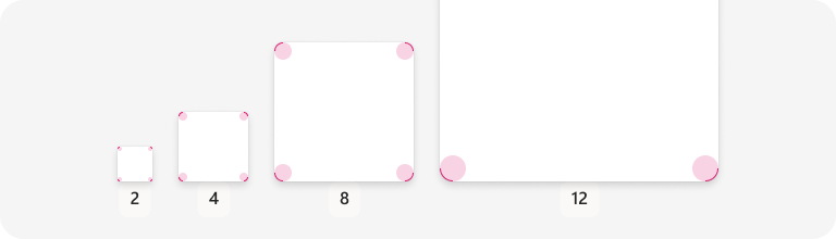
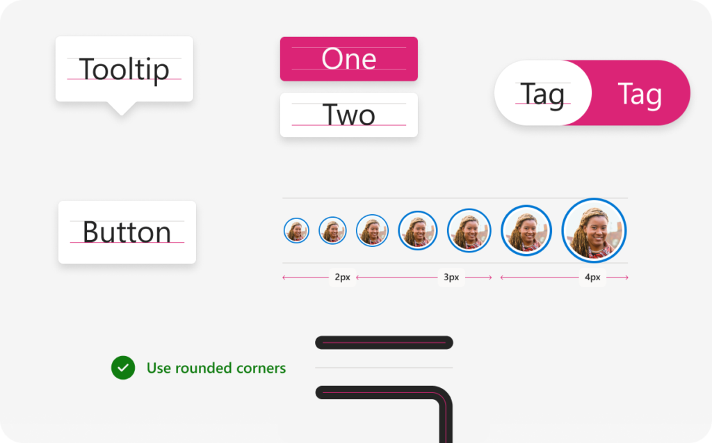
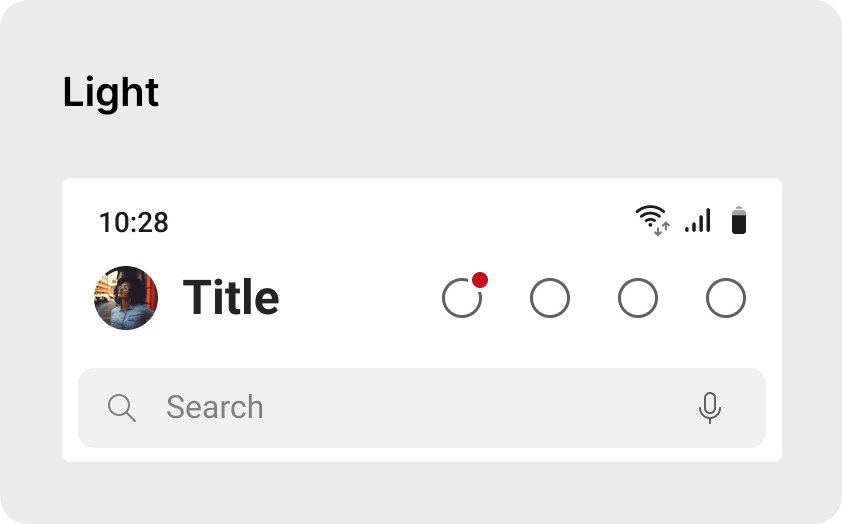
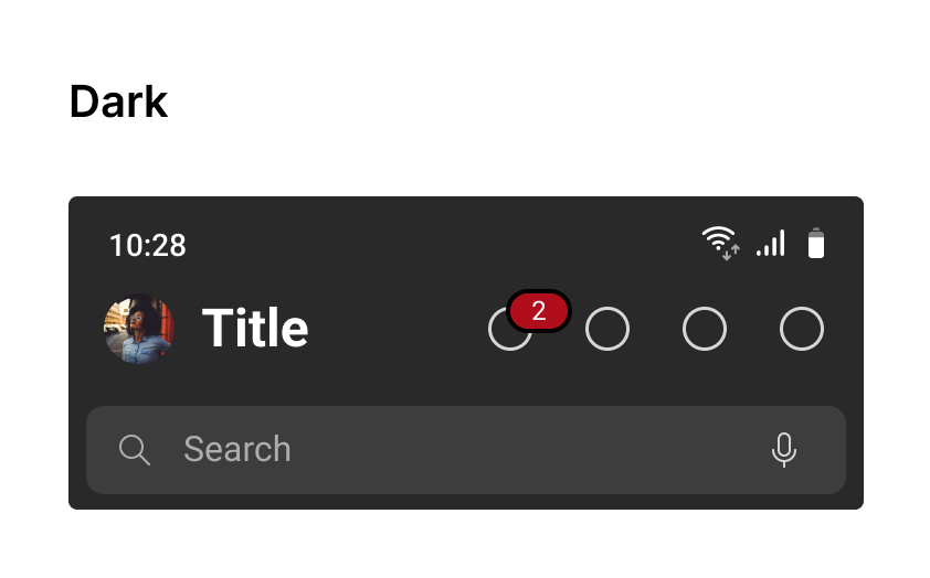
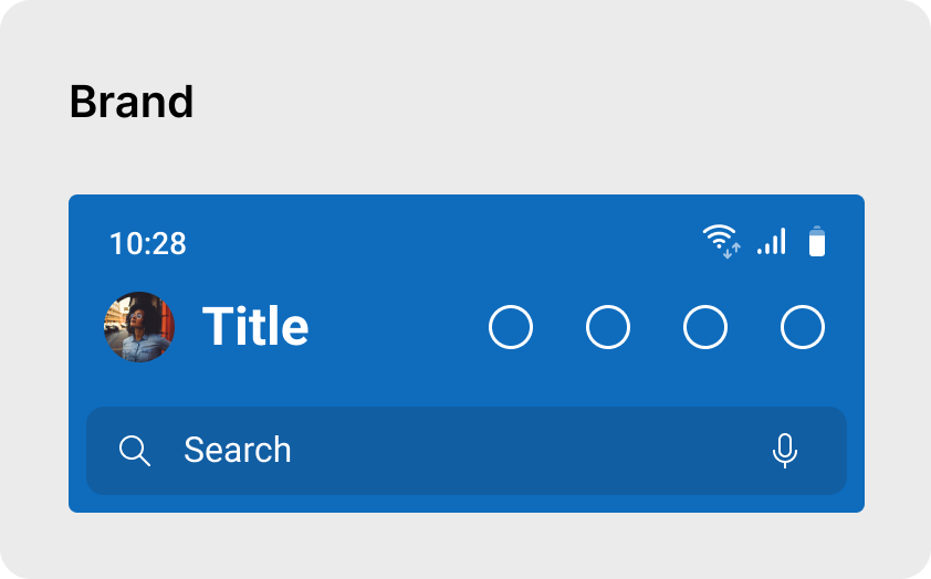
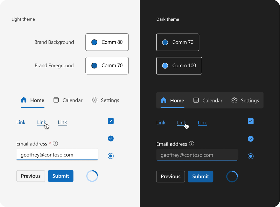
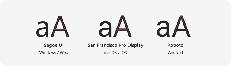
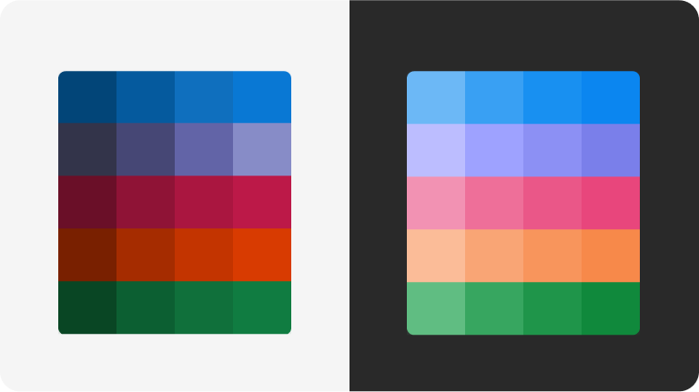
To establish a coherent user experience across devices, Microsoft needed a design system whose philosophy is device/platform agnostic. One set of principal to rule all medium. A system that is tokens based and adhere to uniform set of design principles across organisation.
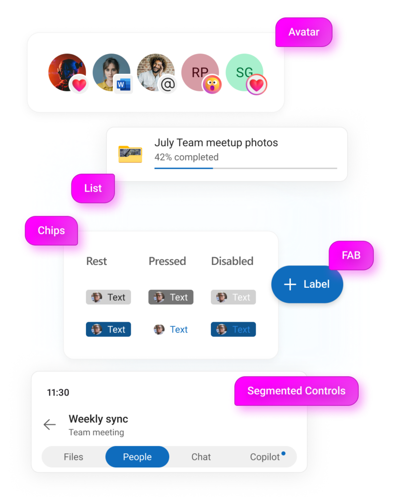
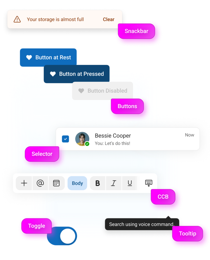
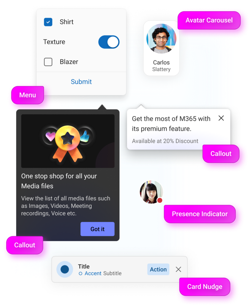
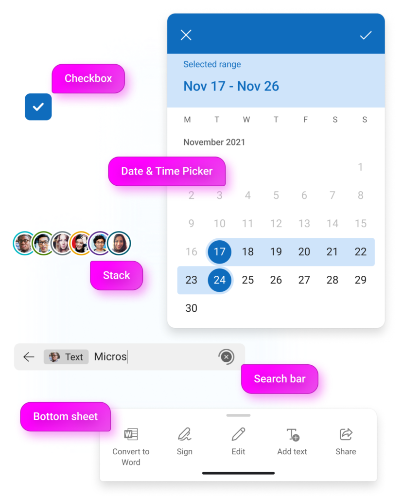
As a ‘system design team’, our responsibility was to create a Design System that binds iOS, Android, Windows and Web together as one quotient. A library which is tokenised and flexible. With consumer-grade user experience, seamless transitions and appealing interface, we created the new version of Microsoft’s design system, Fluent 2.


