Fluent 2: Creating Microsoft's Design System
Microsoft
PORTFOLIO PROJECT
Undertaken by Pulak at Microsoft payroll (Not affiliated with OWL)
YEAR
2024
PROJECT OVERVIEW
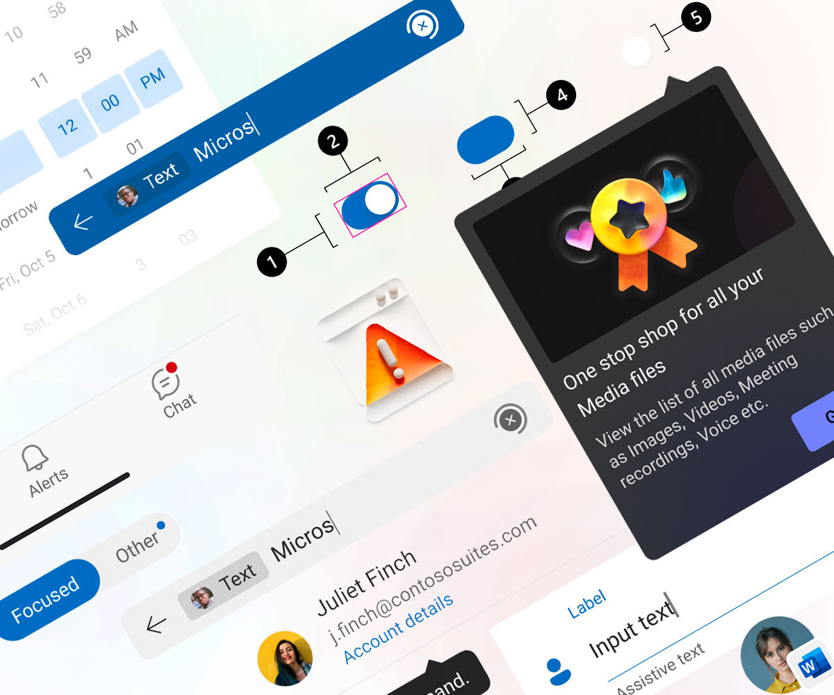
Microsoft ships across iOS, Android, Windows and the web, and every surface once spoke its own dialect. As part of the core Fluent 2 team, I helped replace that with a single, platform-agnostic language — one system of principles that could serve every medium without being tied to any of them.
My focus was the shift from a fixed, per-platform UI kit to a living, token-based foundation, where type, colour, elevation, shape and iconography became named values that hold their meaning across platforms, themes and scale. I worked on the Android chapter — partnering with fellow system designers on the tokens, then building the components and the reference app that proves them in real software.
Why version 2?
Fluent 1 worked. Around twenty Android components shipped and saw real use. But it was built on fixed UI values, without the semantic layer to grow gracefully — changing a variable meant relying on intuition rather than a system.
Version 2 fixes that at the root: a flexible, self-evolving foundation where every value carries meaning and every change is predictable. The vocabulary for that foundation is the token.
Design tokens
Tokens are the vocabulary of the system. Instead of hard-coded values, we named and reused each decision — a colour, a type size, a shadow — so design and engineering speak a common language across every platform. Working with partner system designers, I helped shape the Android set across its five foundations.
Typography
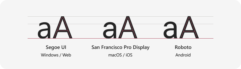
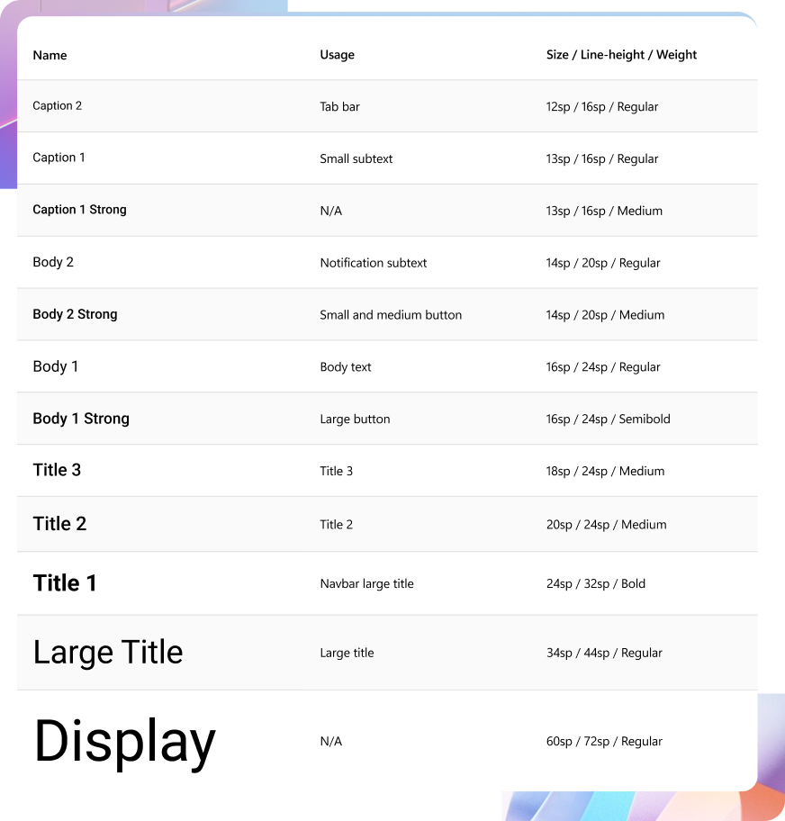
We built the Android type on Roboto, with a full scale from Caption through to Display. Each step pairs a size, line-height and weight to a clear usage, so hierarchy stays consistent wherever it is applied.
Colour
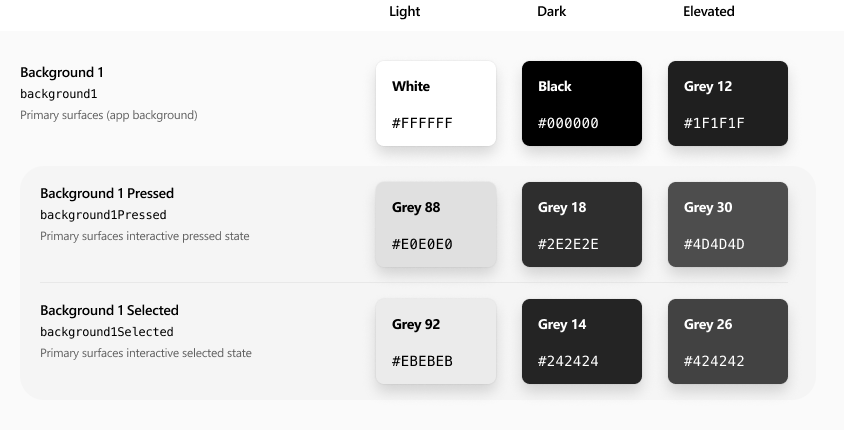
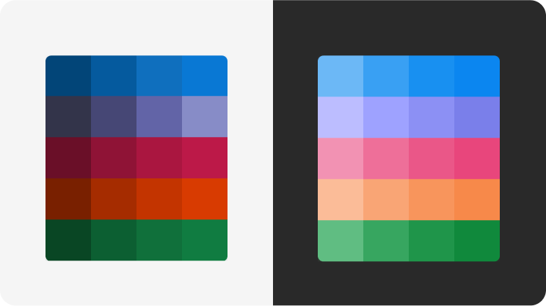
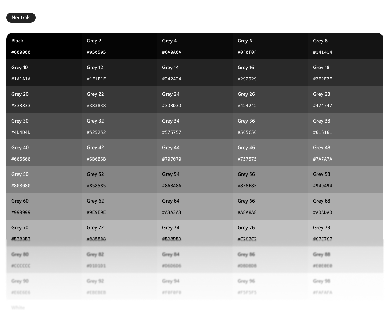
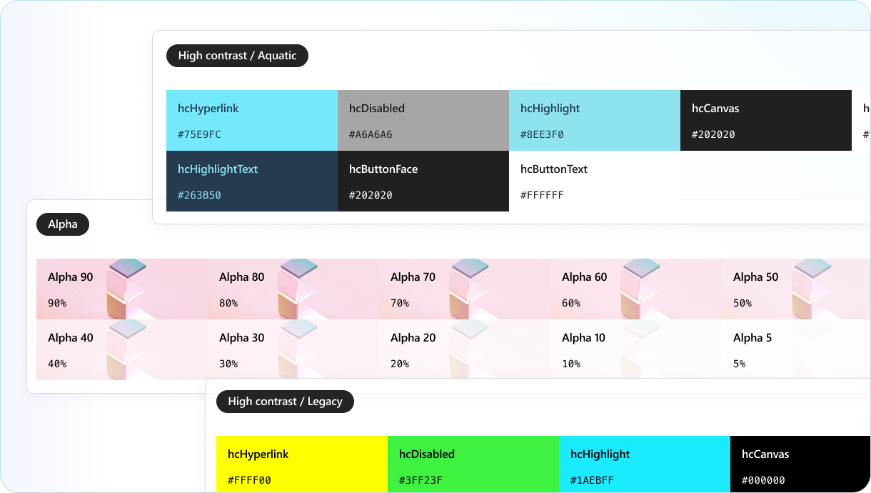
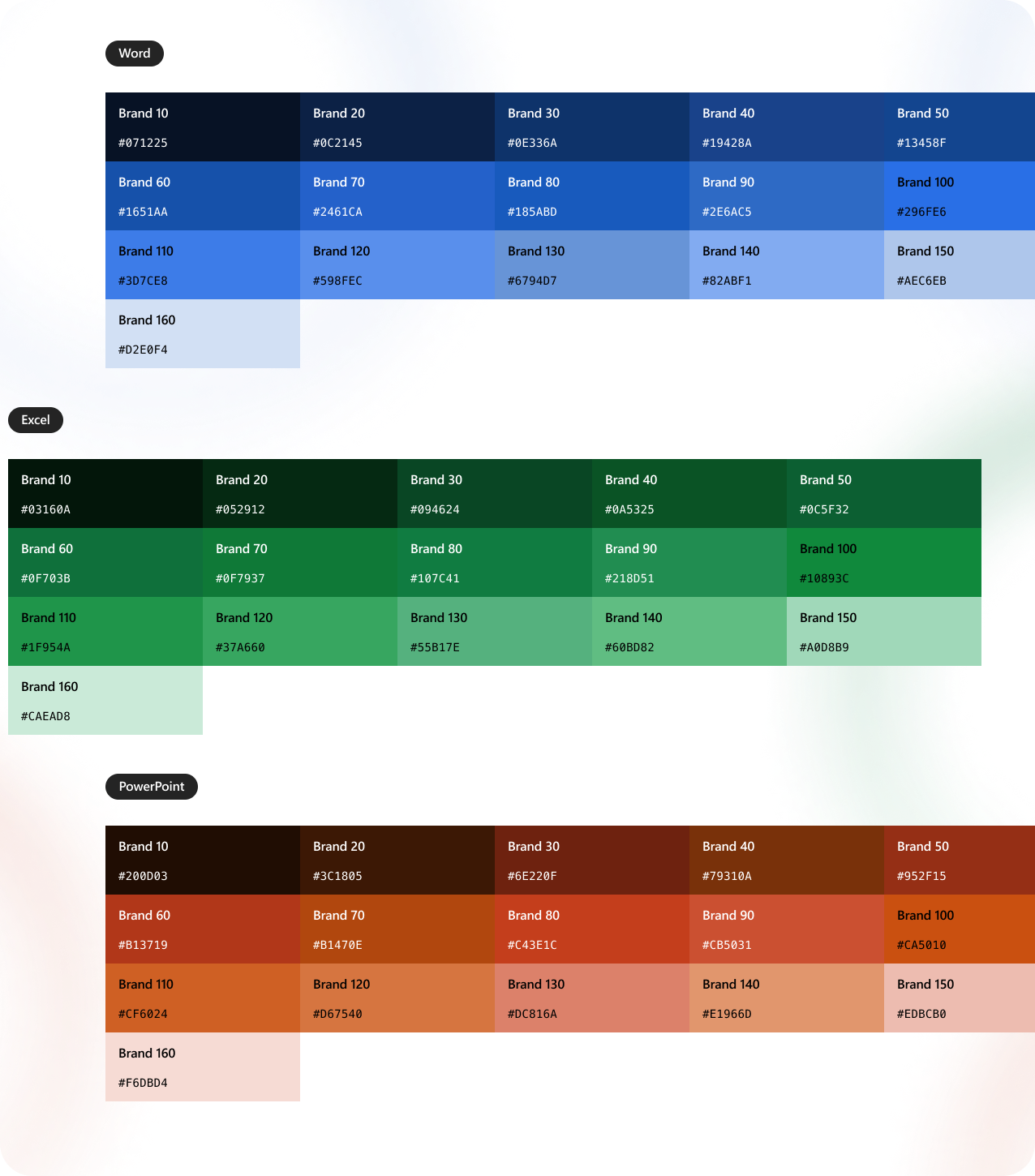
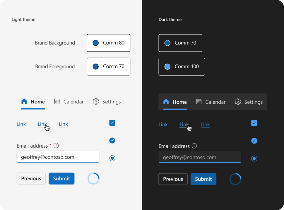
We set up three palettes — neutral, shared and brand — to cover every surface and state across light, dark, elevated and high-contrast themes. Per-app brand ramps keep each product distinct while sharing one underlying structure.
Elevation
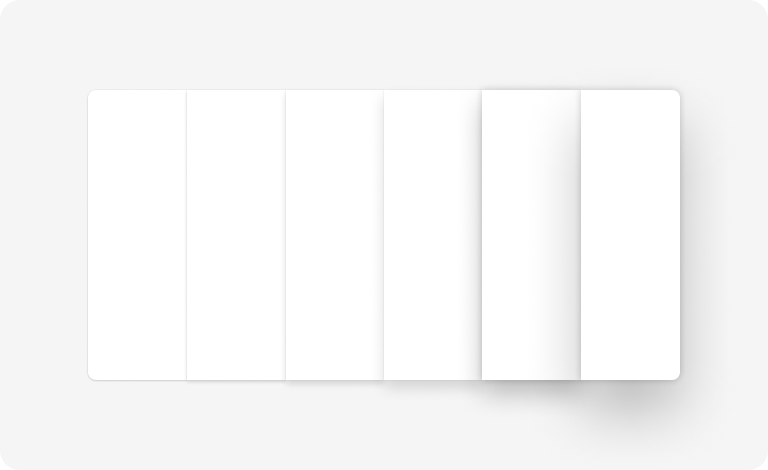
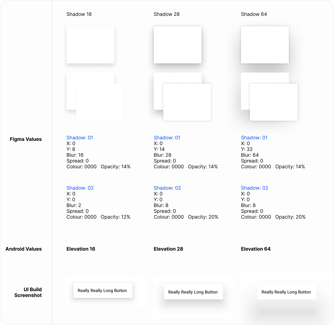
We expressed elevation as paired shadows with defined blur, offset and opacity — mapped one to one between Figma and Android, so a card sits at exactly the same height in design and in build.
Shape
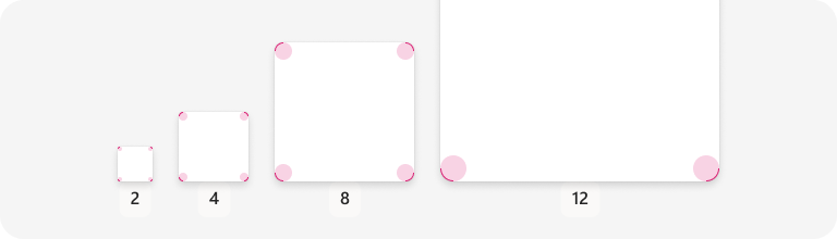
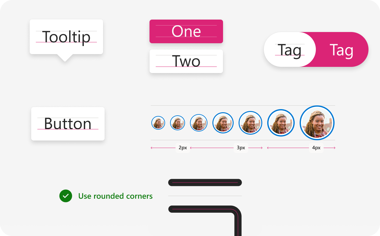
We kept to a small set of corner radii — 2, 4, 8 and 12 — and shapes like rectangle, circle, pill and beak, giving components a consistent silhouette and a softer, more approachable feel.
Iconography
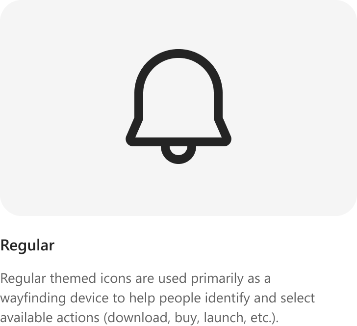
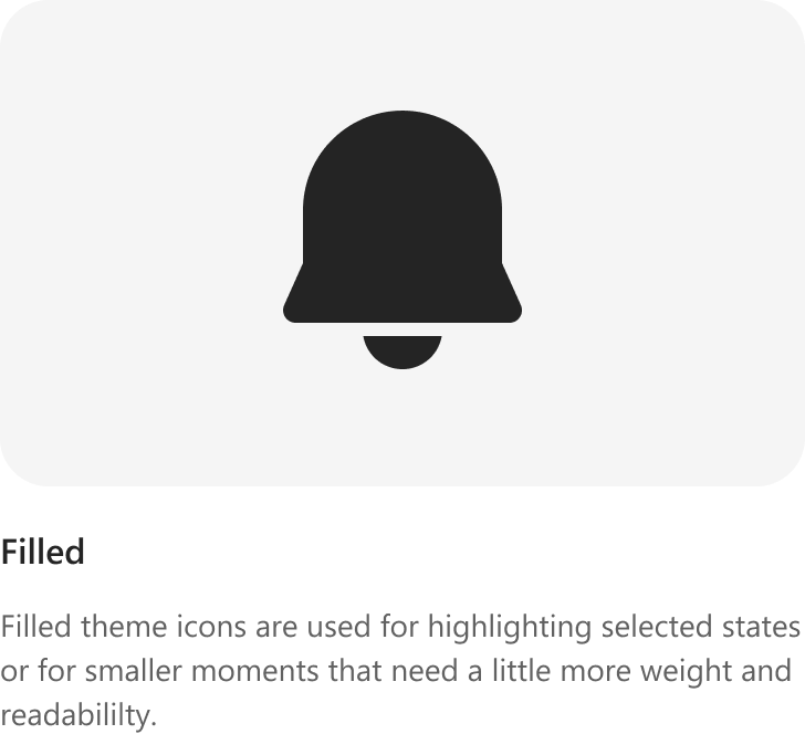
We carried the icon system in two themes: Regular for wayfinding and everyday actions, and Filled for selected states and smaller, higher-emphasis moments.
UI components
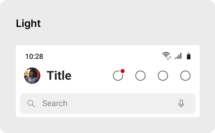
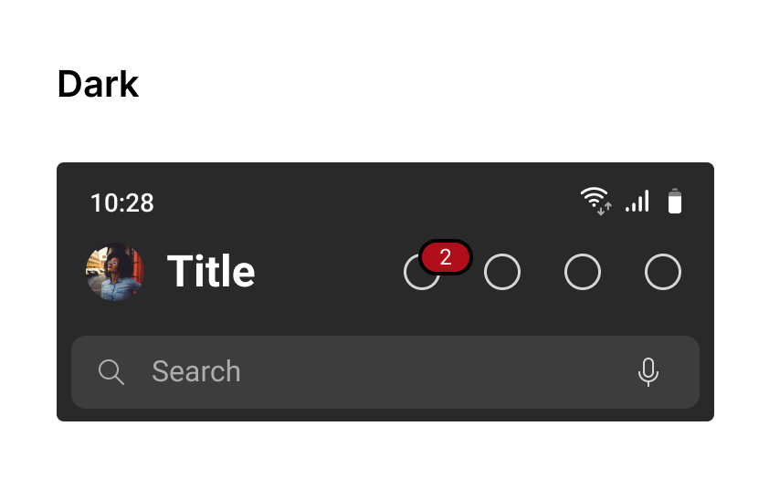
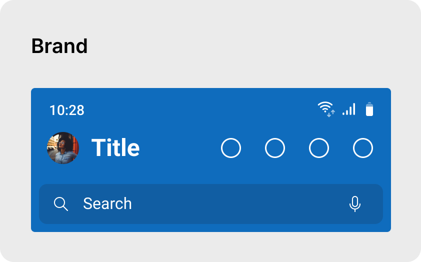
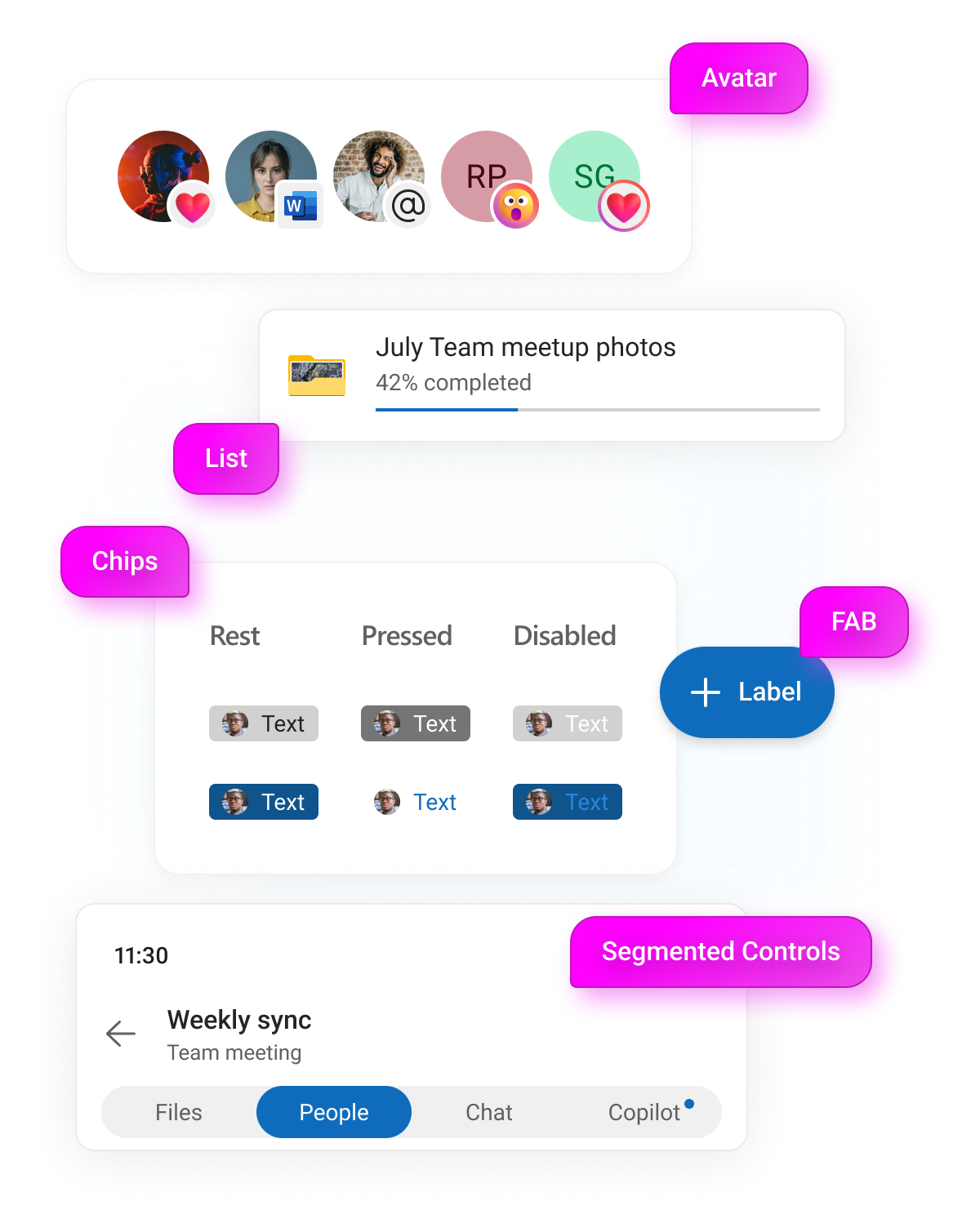
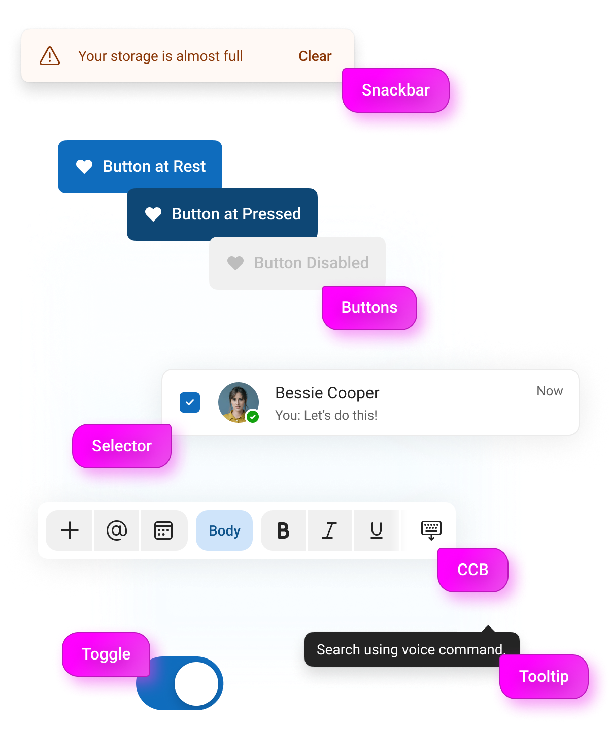
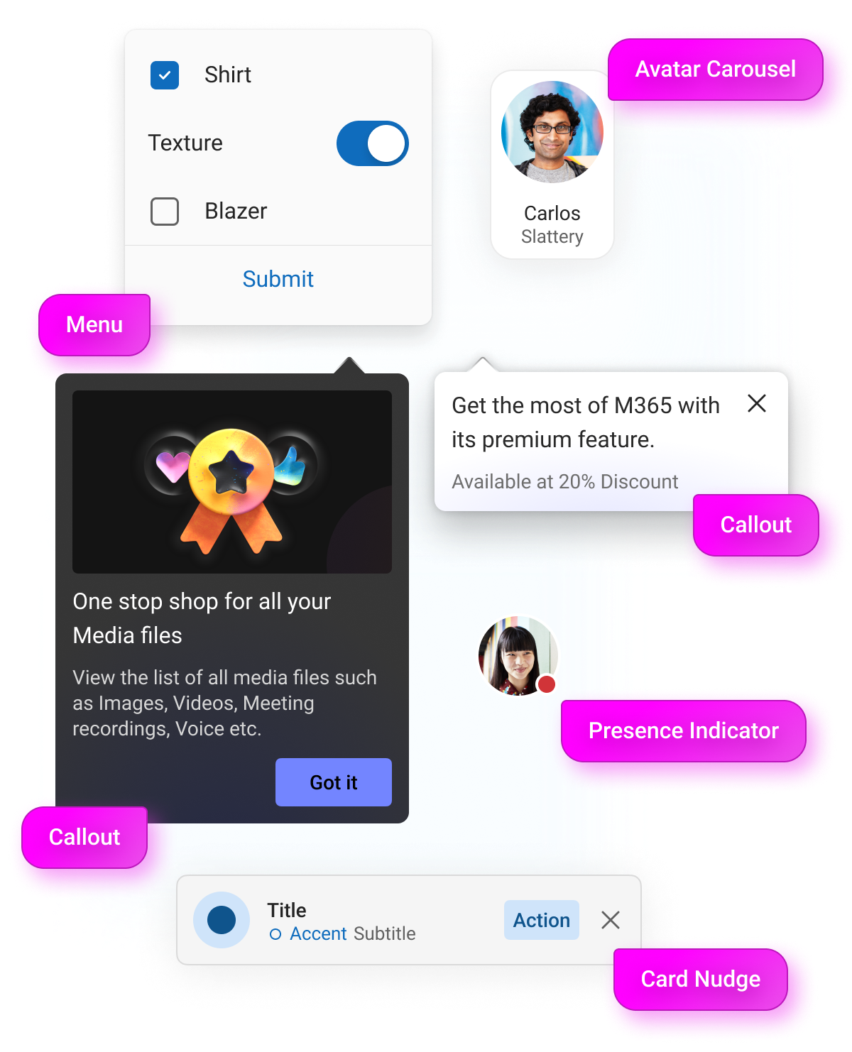
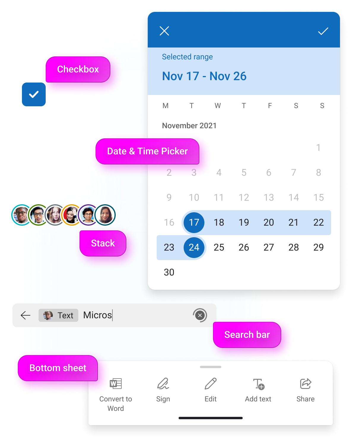
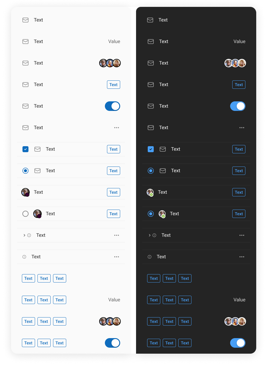
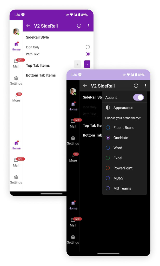
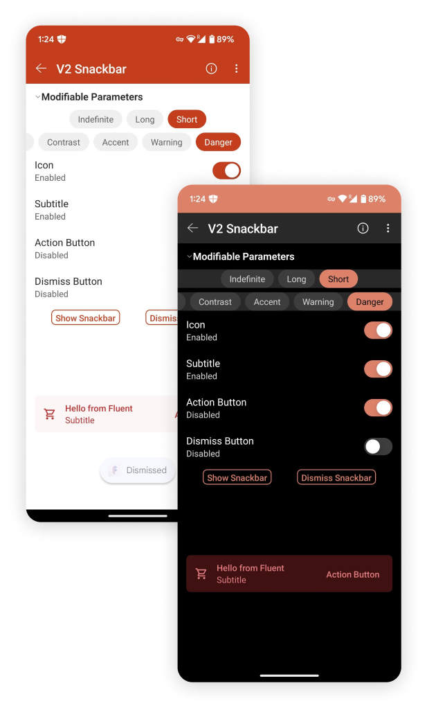
With the tokens in place, the components were mine to build. I created every one myself, shipping each in four themes — Light, Dark, Brand and Brand dark — and grew the Android library to around twenty-four core components with more than a hundred and forty supporting sub-component variables.
Building the Fluent app
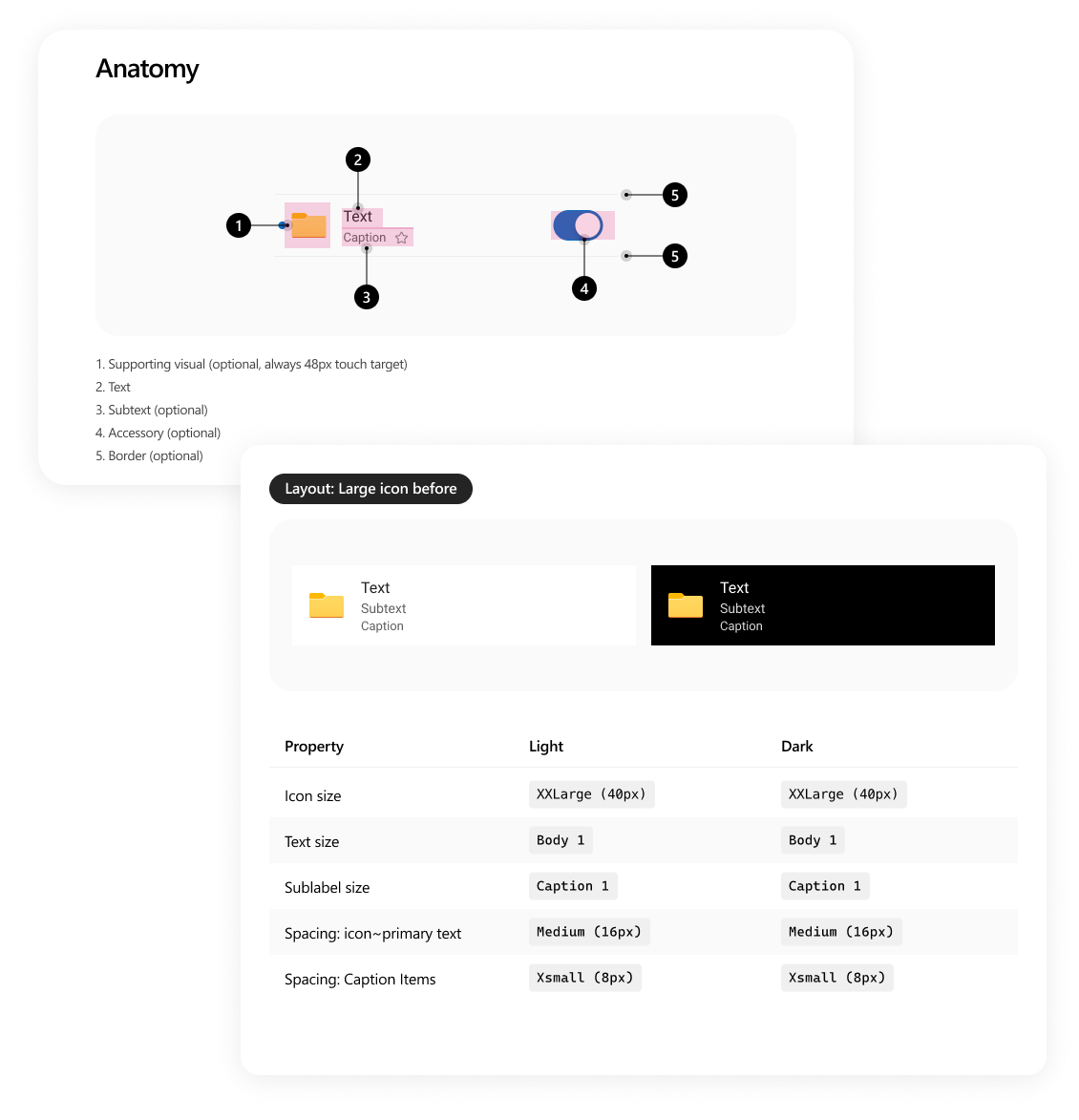
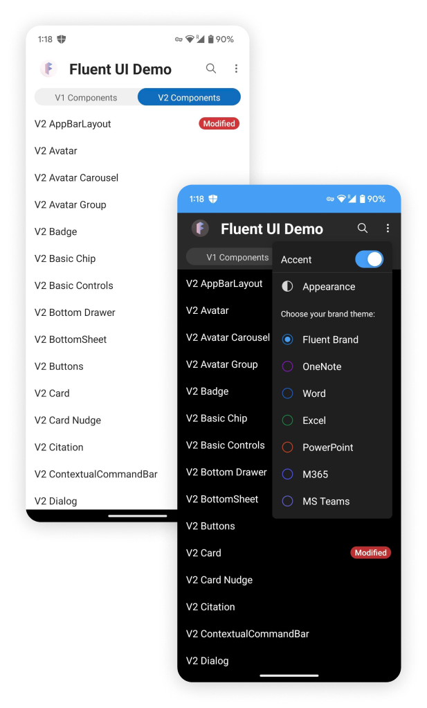
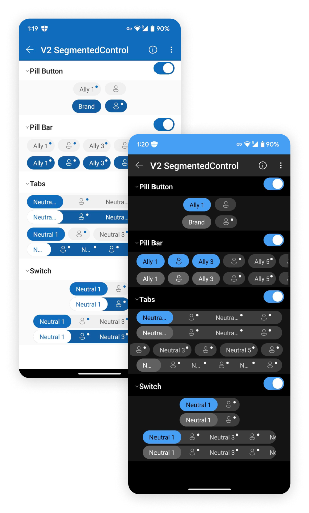
Guidelines only hold if they are proven in real software. Working closely with developers to define usage, I helped build the entire Fluent reference app at Microsoft IDC Hyderabad. Each component began from a hand-off file I prepared with its structural detail, then got rebuilt, themed and stress-tested inside a live Android app.
Impact
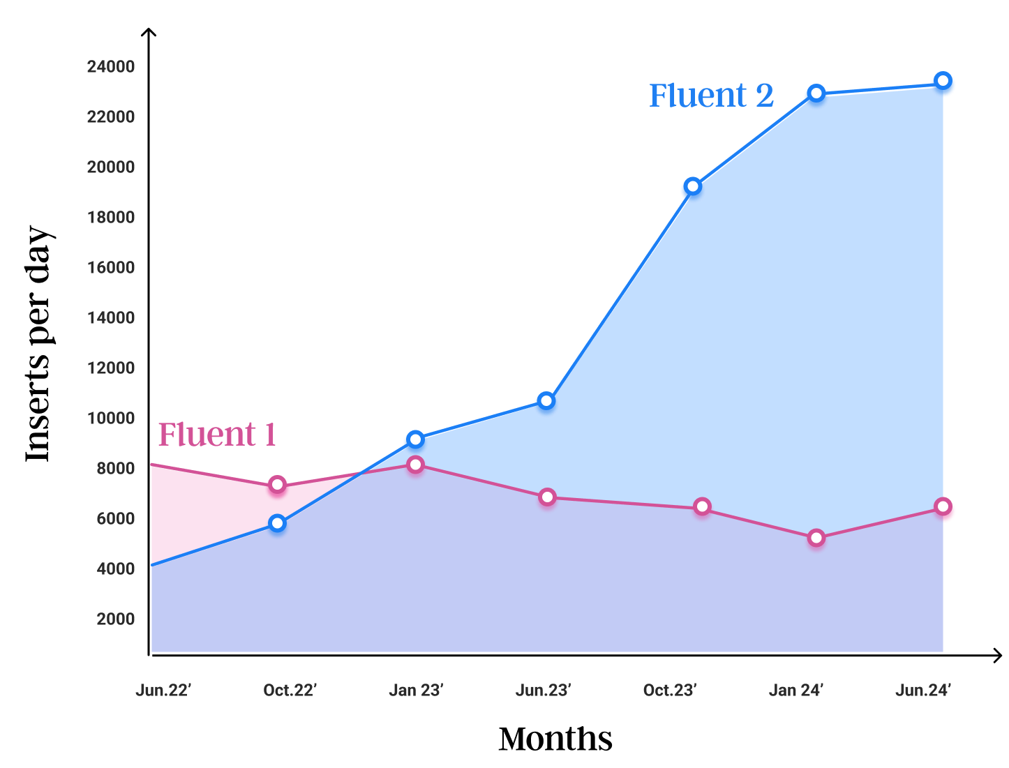
As of August 2024, 293 design teams inside Microsoft build on Fluent 2, driving around 22,000 inserts a day — roughly four times Fluent 1. Built on Jetpack Compose with tokens published openly on GitHub, the system now reaches well beyond Android: Fluent UI React v9 shipped on the same foundations, with measurable gains in performance and accessibility.
For me, a design system earns its keep when thousands of screens move faster because the hard decisions were made once — named, shared, and true across every platform.