Branding and Web Design
Gyan Jaipur & Gyan Museum
PROJECT OVERVIEW
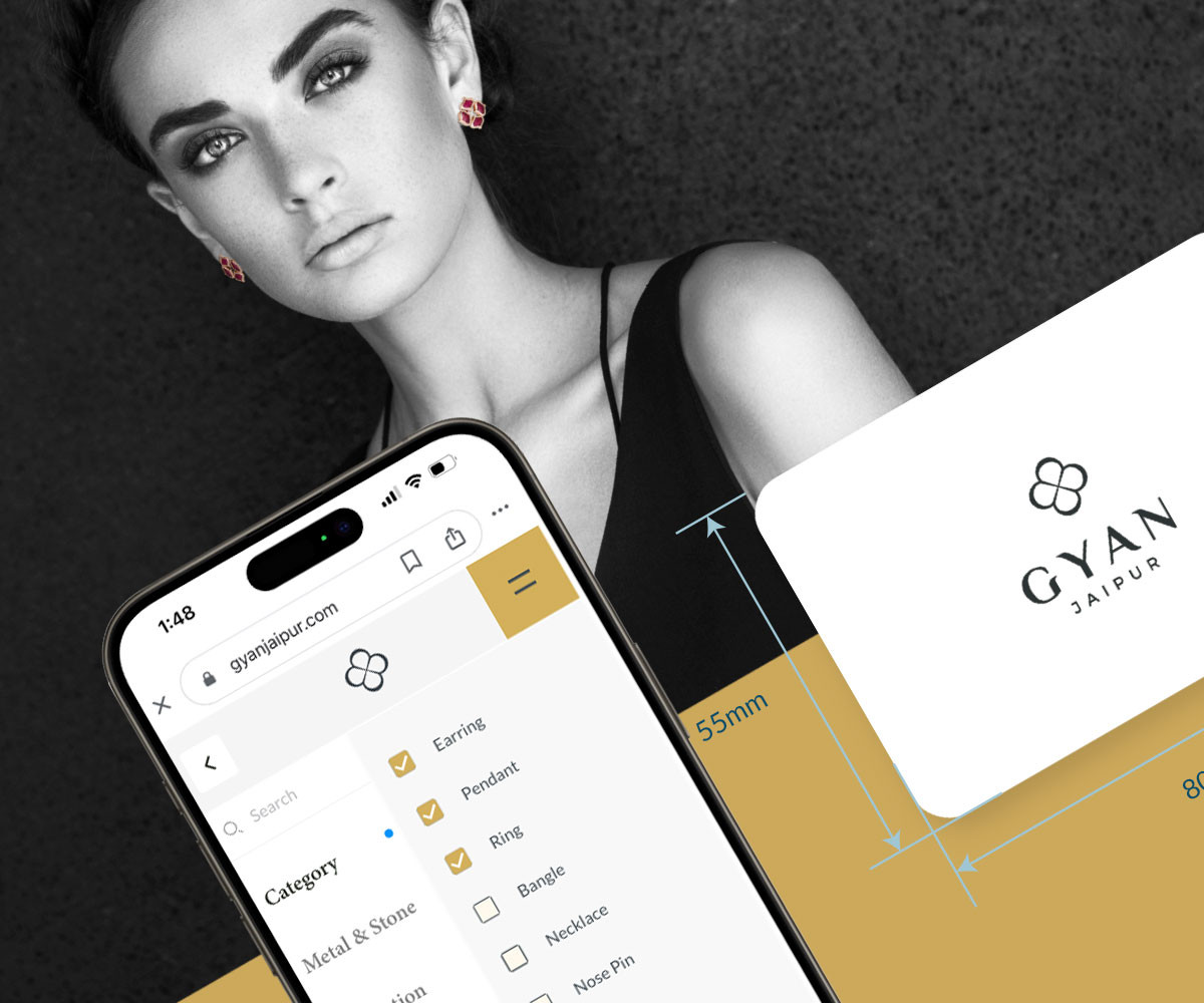
The Dhaddha family has manufactured fine jewellery for five decades, crafting for luxury houses across the world. Gyan Jaipur was their move into a retail brand of their own — precious gems for an affluent audience, online and offline, across India and Europe.
The identity had to hold two worlds at once: Gyan Museum, a two-thousand-year-old collection of rare artefacts, and Gyan Jewels, its contemporary future. The brief was disarmingly simple — elegance, simplicity, luxury.
Understanding the brand
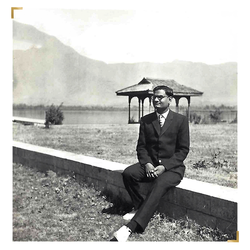
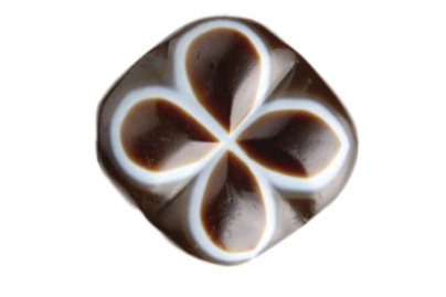
The story starts with an object. Late Mr. Gyan Chand Dhaddha wore a Sulemani agate cut like a four-leafed clover — a stone he believed carried his luck, and one of the most treasured pieces in the museum he built.
That single artefact became the anchor: a mark that could link the family's heritage to its future without ever feeling like a relic.
Shaping the mark
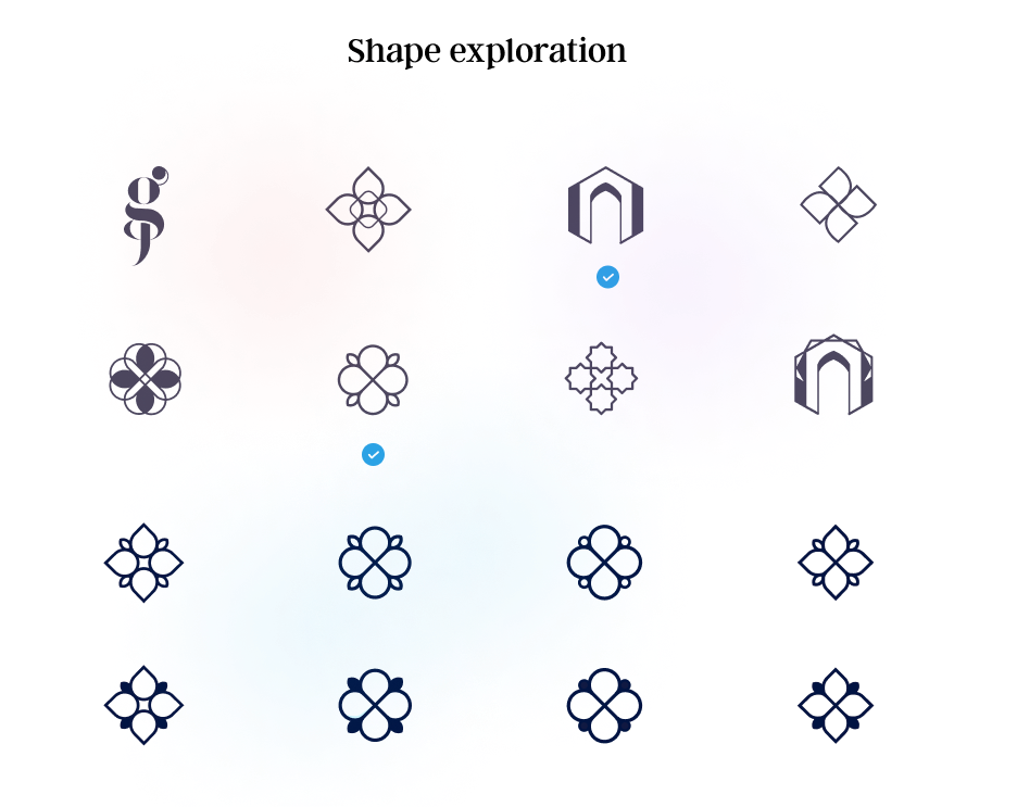
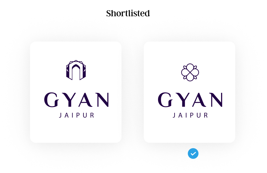
The old logo used a literal cut-out of the agate — beautiful, but impossible to scale into a luxury brand. Exploration began from scratch around a tight set of words: Jaipur, heritage, rarity, luxury, simplicity.
Each round pushed the form further from photograph and closer to symbol — versatile across sizes, materials and every surface the brand would touch.
The new mark
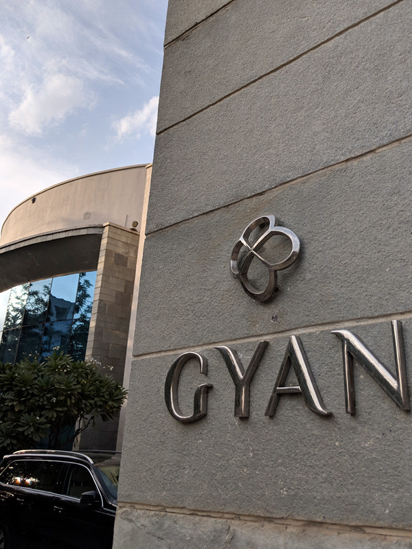
A minimal, edgy rendition of the Sulemani agate — quiet confidence with real character. Paired with a strong, balanced wordmark, it anchors everything from storefront signage to a favicon without losing itself.
Colour and pattern
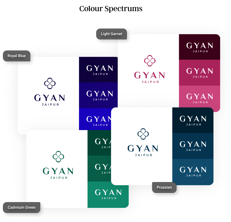
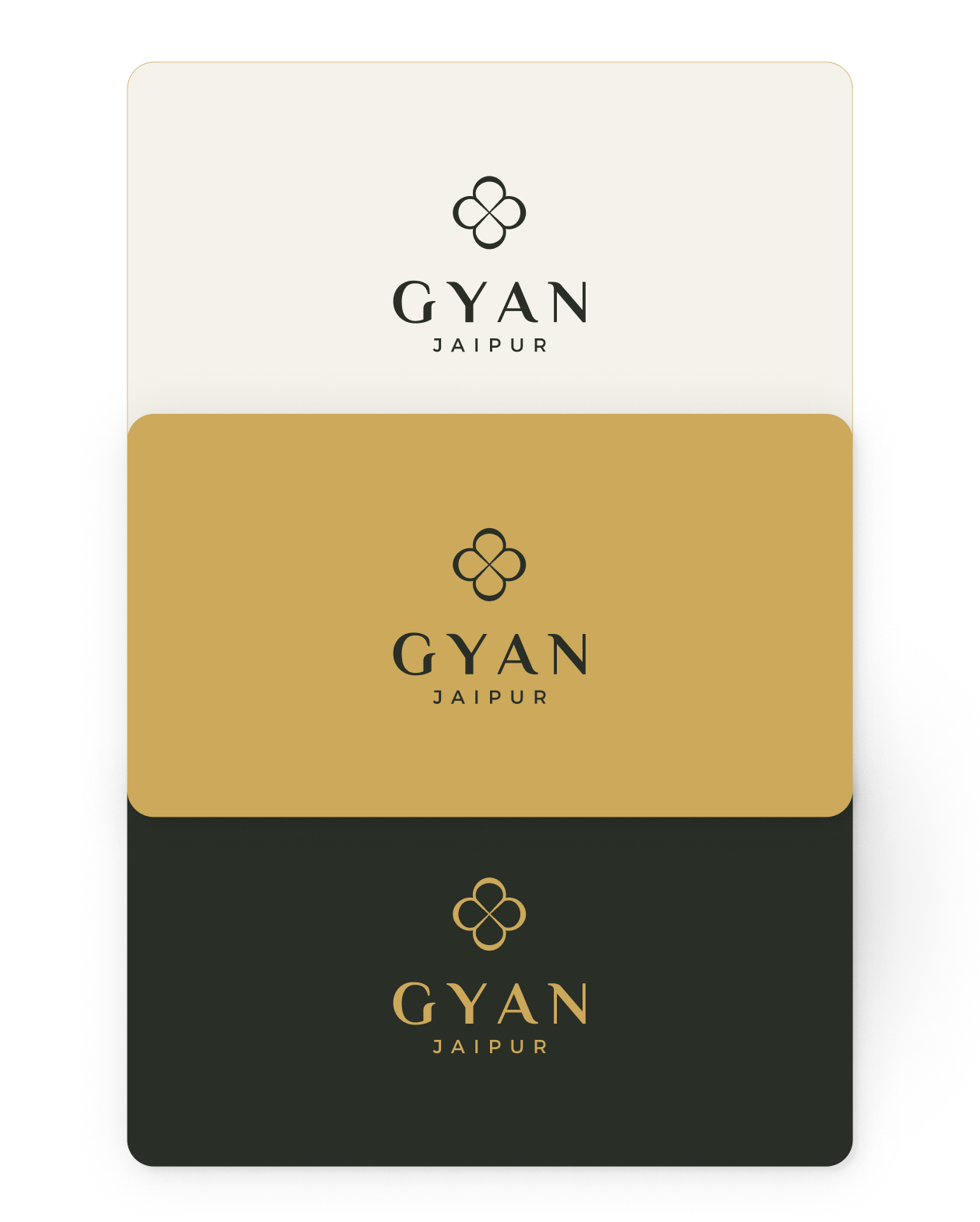
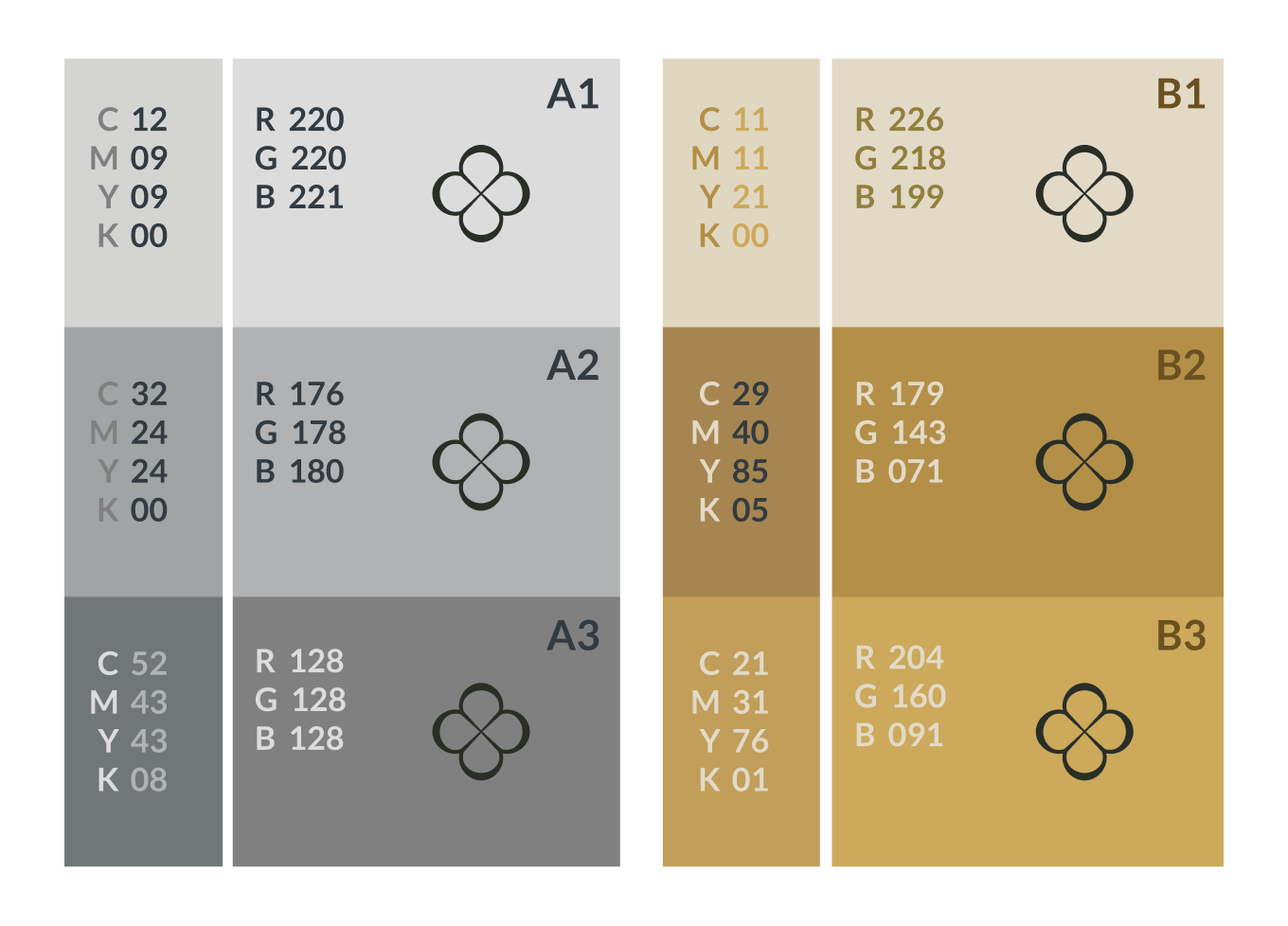
Primary colours set the brand's mood — restrained, warm, unmistakably premium. A disciplined system of tints and shades extends that palette across collateral, environments and digital product.
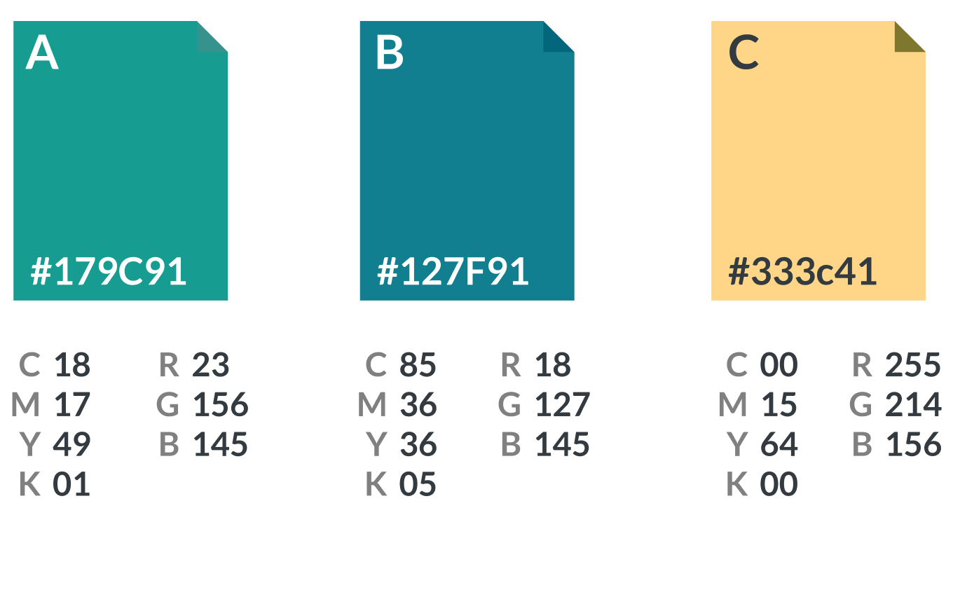
Gyan Museum earns its own vibrant trio, distinct enough to celebrate the collection while still reading as one family.


A pattern language
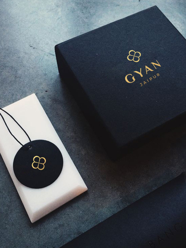
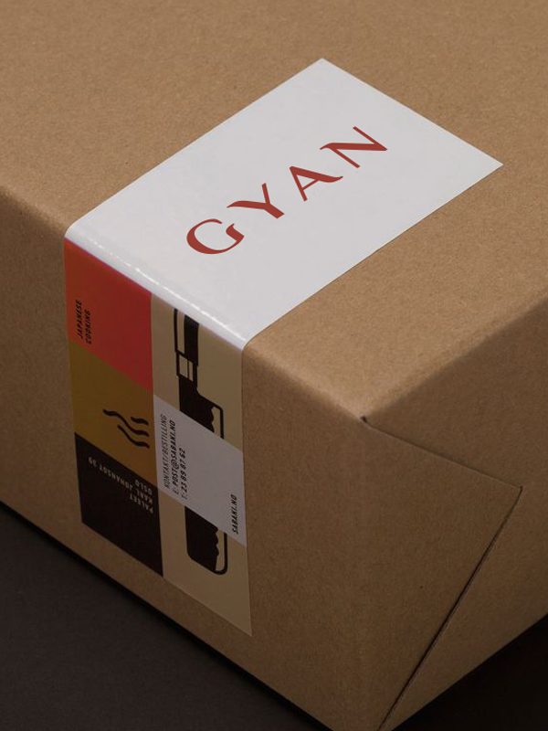
Patterns give the brand consistency and recall — a visual signature that turns packaging, print and environment into something recognisably Gyan long before the logo is read.
A brand book, built to be used
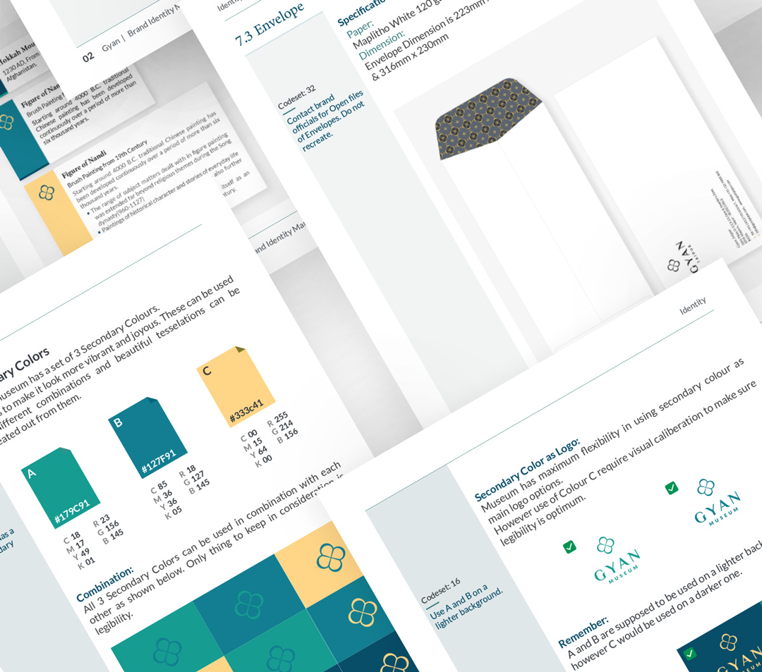
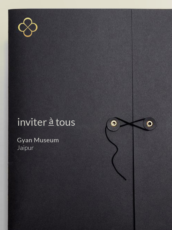
The system was codified across Identity, Communication and Merchandise — logo, colour and type; imagery, photography and tone; stationery and collateral. Enough structure to stay coherent, enough room to keep creating.
The brand, online
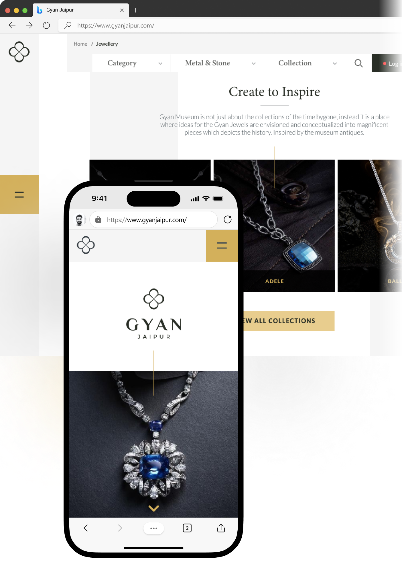
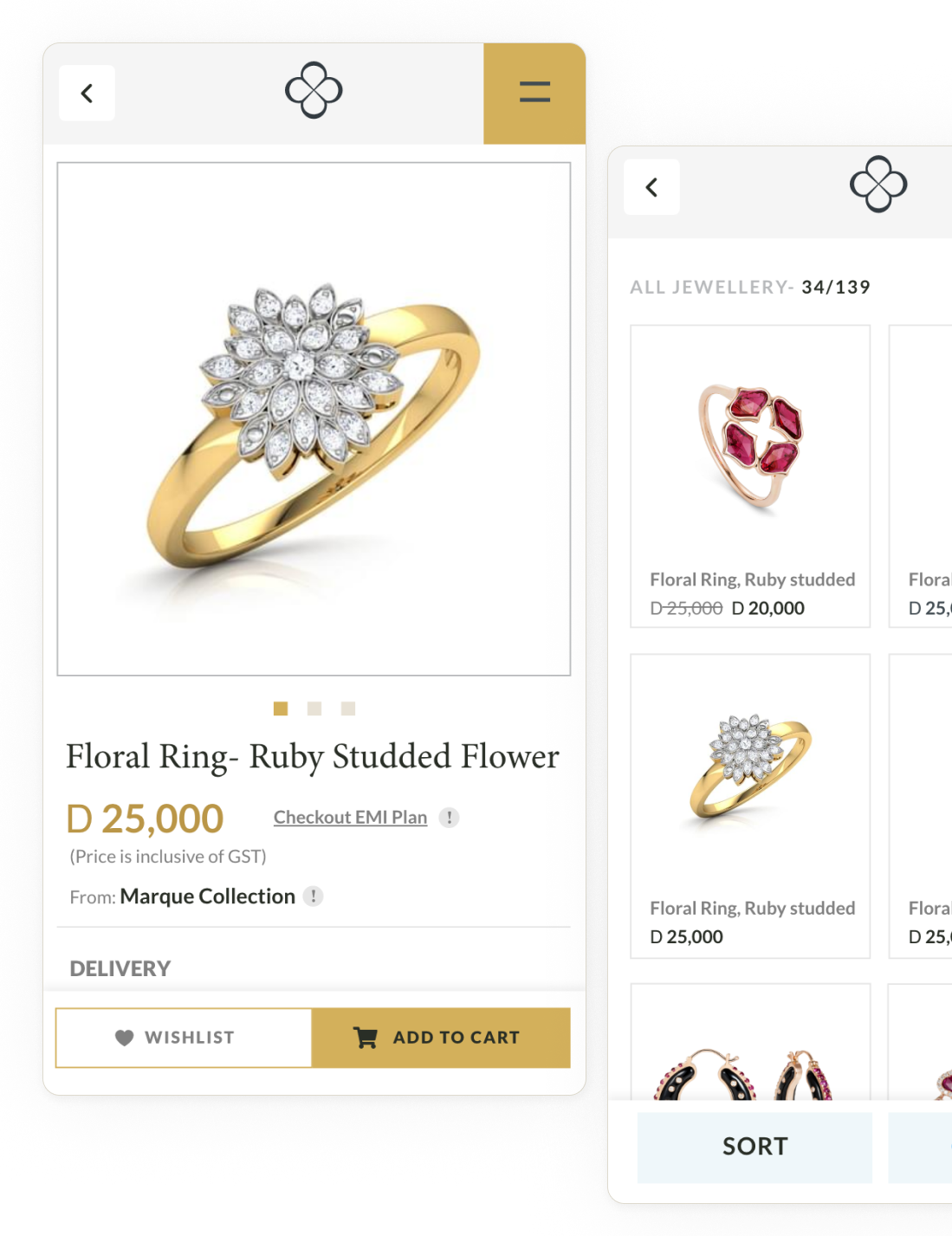
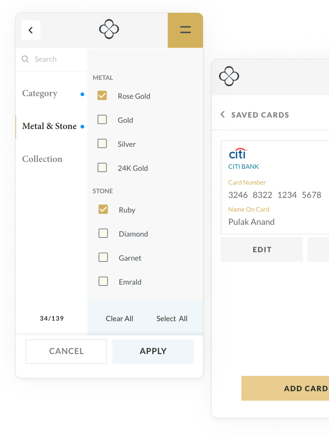
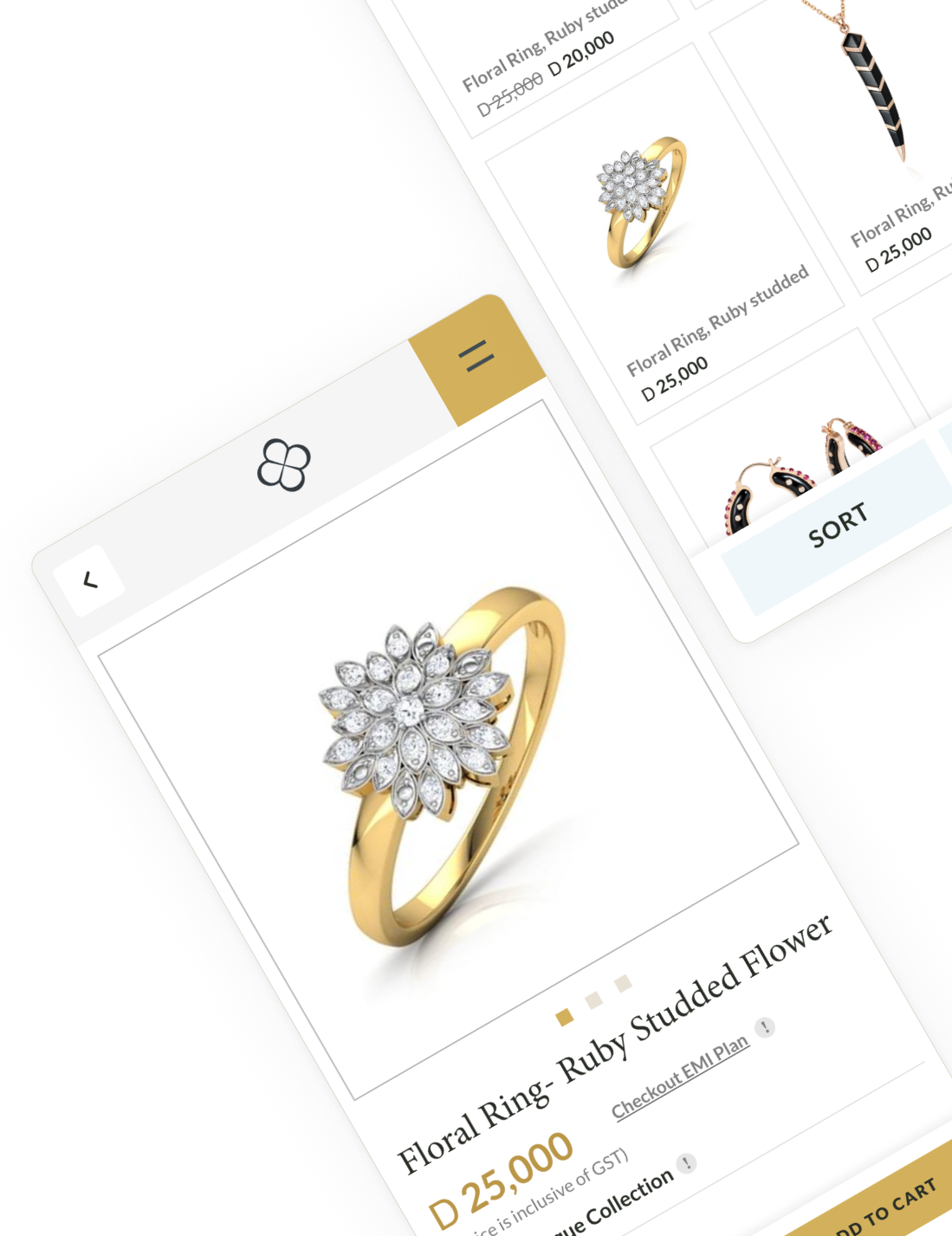
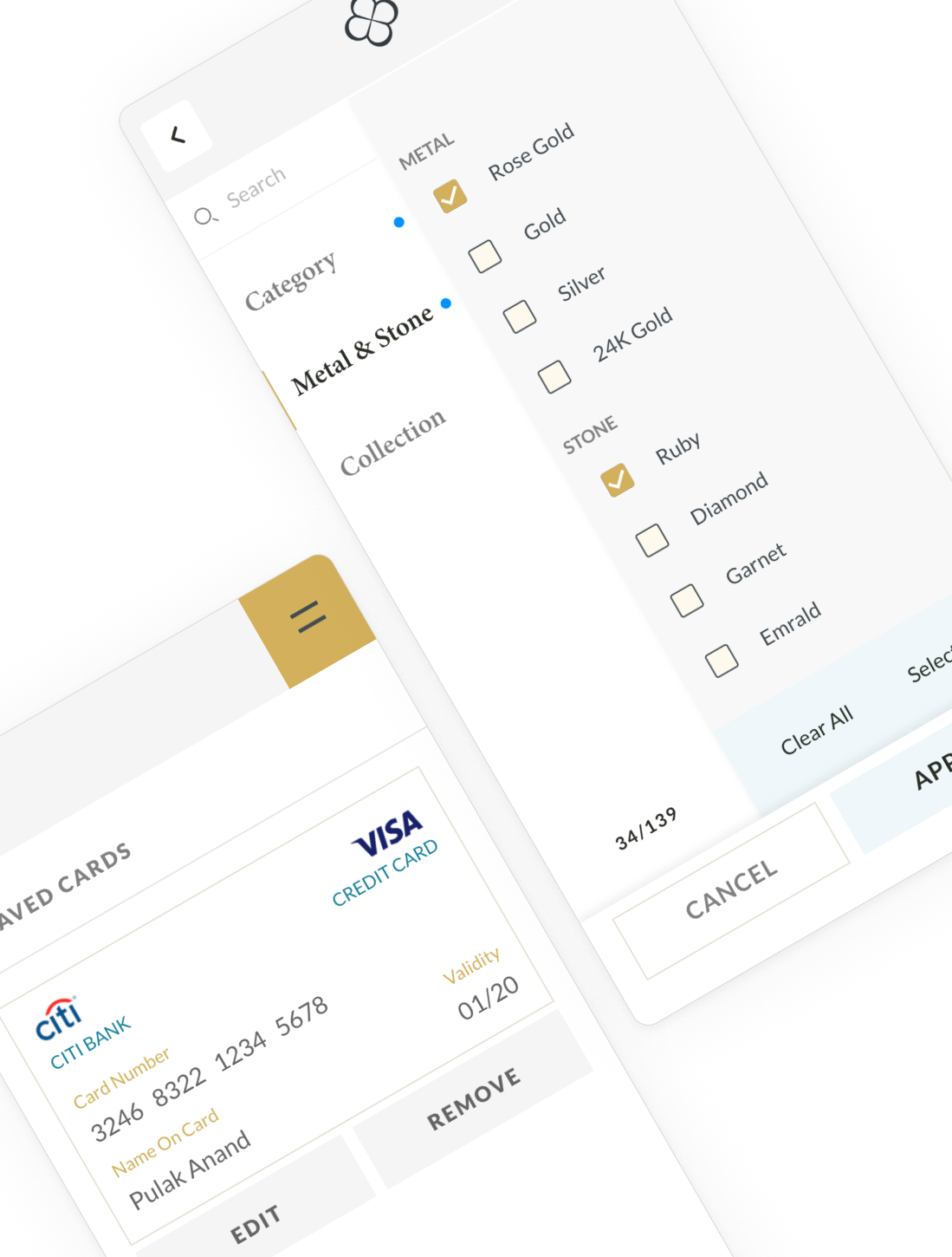
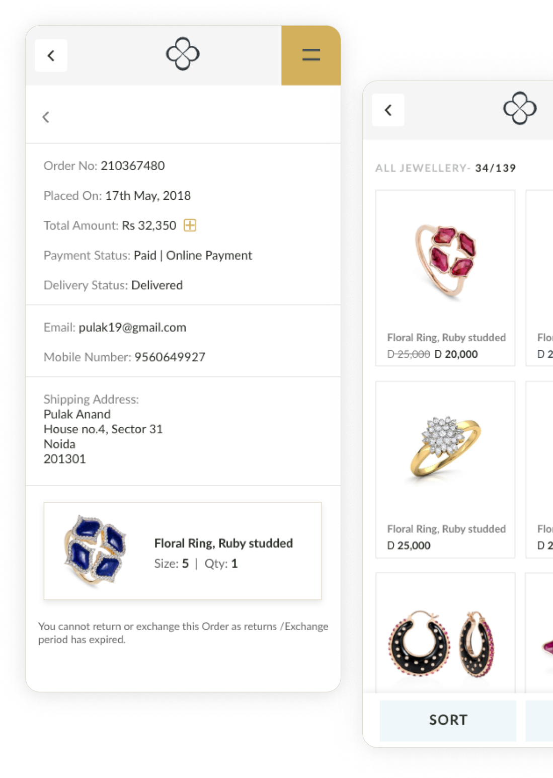
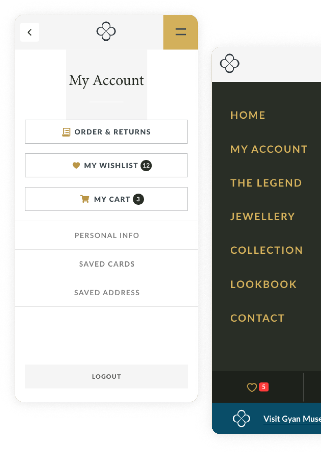
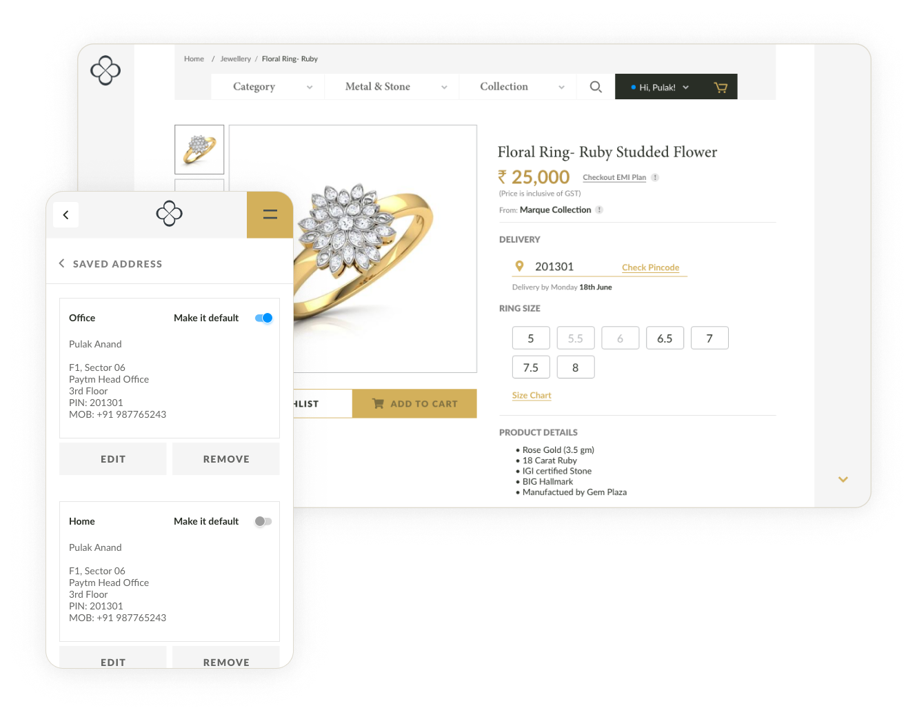
The website carries the same restraint into the digital space — the collection given room to breathe, the museum's story told with the same voice, the identity intact from storefront to screen.
"I really enjoyed my time working with Owl on the Gyan Jaipur and Museum rebranding. The identity captured exactly what we hoped for — a mark that honours our heritage while placing us confidently in the luxury market."
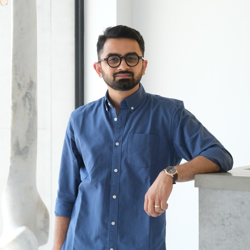
Akhil Dhaddha
Managing Director, Gyan Jaipur & Gyan Museum
Heritage handled with restraint becomes something rare — an identity that honours where a brand came from while making room for everywhere it's going.