Icon, Illustration and motion graphics for Paytm
Paytm
PORTFOLIO PROJECT
Undertaken by Pulak at Paytm payroll
YEAR
2017
PROJECT OVERVIEW
Paytm reaches hundreds of millions of people across payments, banking, gold and commerce — dozens of teams, all shipping fast. A shared visual language was the only way to keep the brand coherent.
I set that common ground: an illustration system, a motion language and the brand rules to hold Paytm Payments Bank, Paytm Gold and Paytm Mall together — so any team could produce on-brand assets without a specialist in the room.

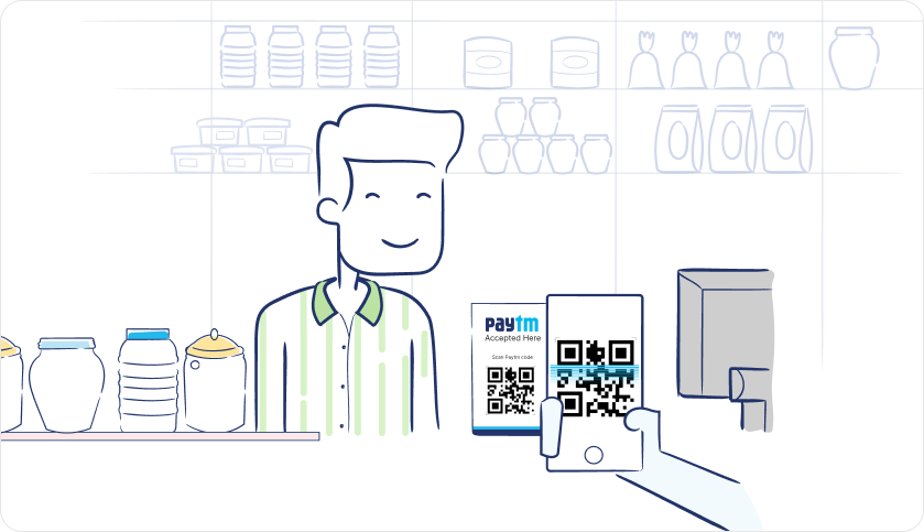
An illustration styleguide
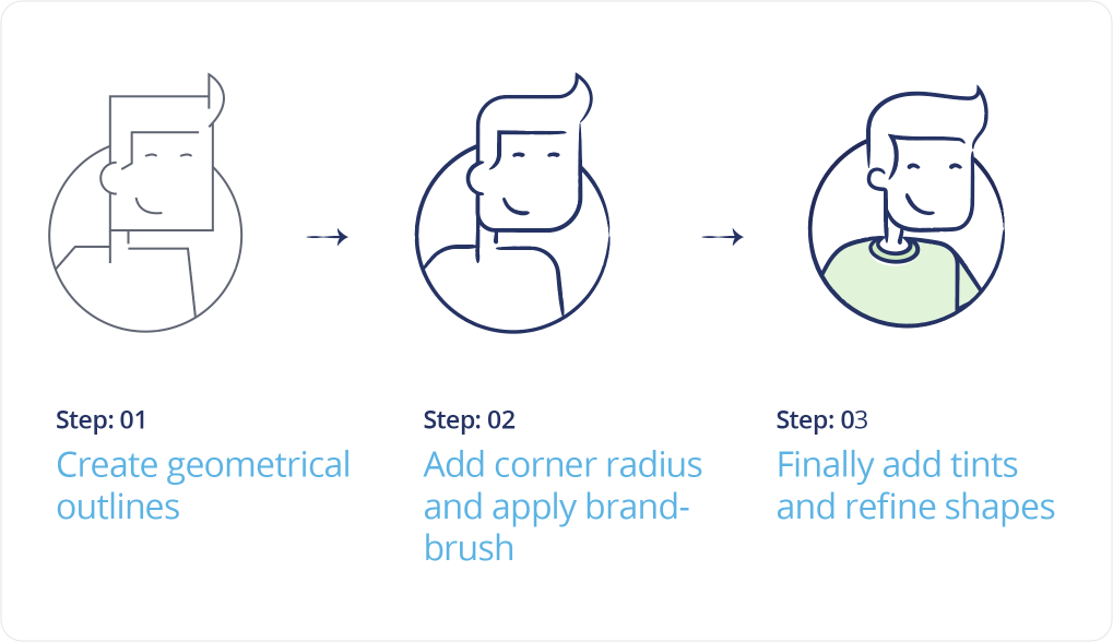
Most of the storefront team had never drawn an illustration. My styleguide codified how they are built — turning a specialist craft into something any product designer could ship, on-brand.
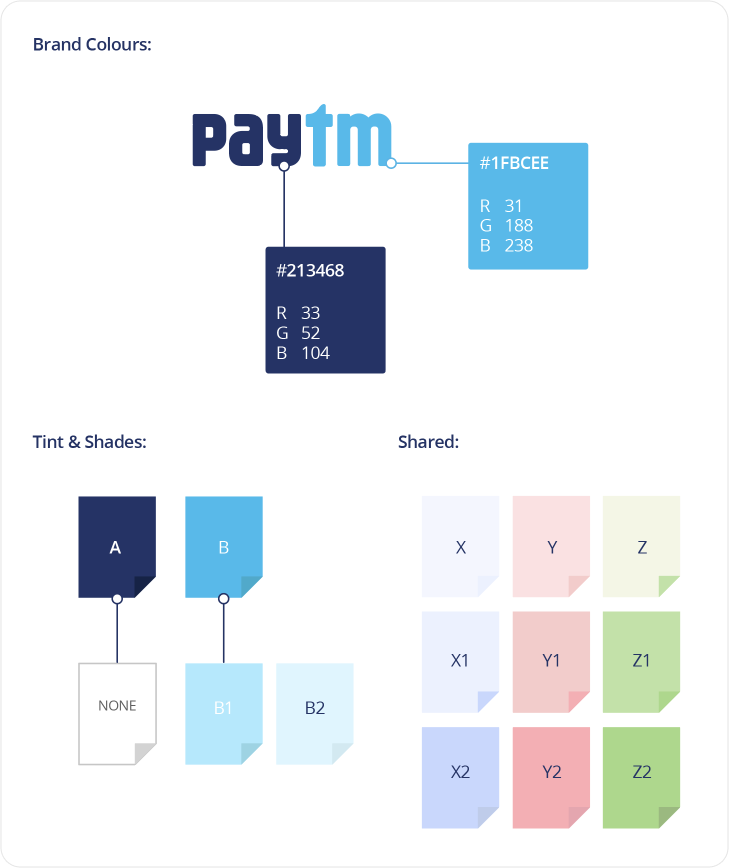
Brand building blocks
I built every asset from Paytm's brand colours, extended through a disciplined range of tints and shades — unmistakably Paytm at a 24px icon or a full-screen campaign.
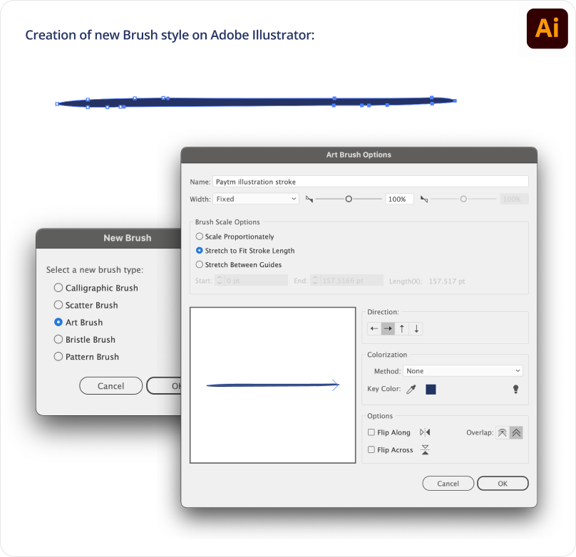
A signature stroke
I made a custom Illustrator brush that gives every illustration the same hand-drawn edge — one detail that makes any asset read as Paytm at a glance, no matter who draws it.
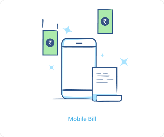
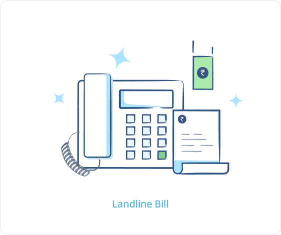
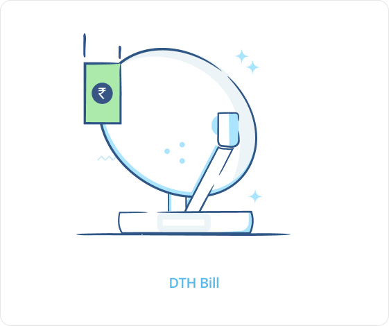
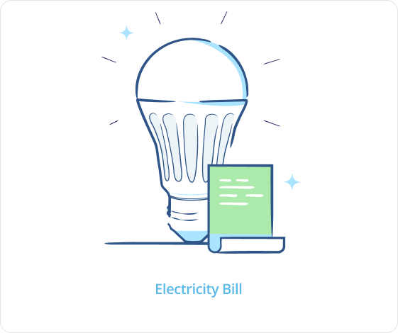
An illustration library
With the rules settled, I built a reusable library — a shared vocabulary designers reach for instead of starting from a blank canvas.





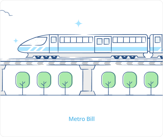
Motion design
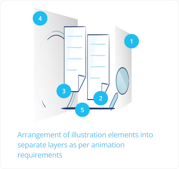
I kept Paytm's motion infographical — subtle and informative. The layer-based animation I set up keeps every stroke crisp instead of reshaping curves frame by frame.
Paytm Gold
Communication design for buying, storing and selling gold digitally. My storyboard met the real hesitations — where the gold is kept, whether the purity holds — then reframed the whole idea around one disarming promise.
Start investing in gold with as little as ₹1 — the barrier to entry, removed.
Paytm Mall
An e-commerce platform linking hyperlocal sellers to customers — subsidised delivery, logistics and financing. My ad films made a dense feature set legible in seconds.