Flight Booking Experience
Paytm
PORTFOLIO PROJECT
Undertaken by Pulak at Paytm payroll
YEAR
2018
PROJECT OVERVIEW
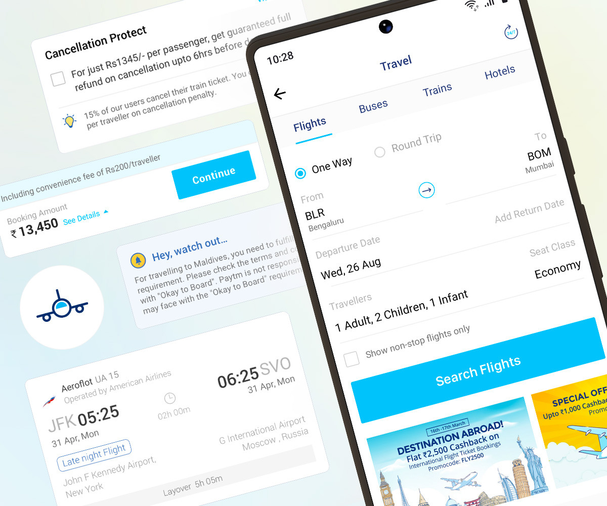
Paytm's flight booking flow needed to feel effortless on a small screen. I focused on its two heaviest moments — reviewing an itinerary and entering traveller details — the points where a booker carries the most information and the most doubt at once.
I studied how people actually book: their journeys, their patterns, the small anxieties that stall a purchase. My answer was to break dense information into bite-sized, digestible steps — lowering cognitive load so the experience reads as intuitive rather than overwhelming.
Built for a mobile-first audience
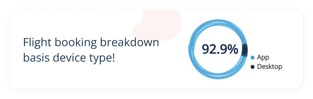
In 2017, Paytm was India's largest fintech — over 350 million active users and roughly 65% market share. For flights, the phone wasn't one channel among many; it was very nearly the only one, so I designed for it first.
The problem, precisely
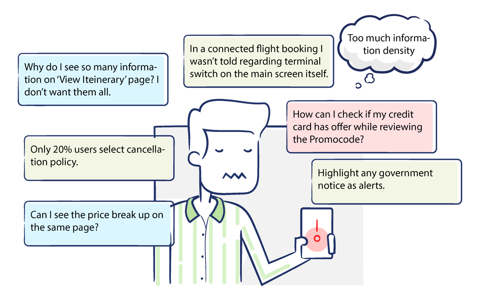
Every quarter the research team shared insights that set our priorities. Within the flight flow, I zeroed in on the two areas carrying the most friction — the review itinerary and traveller information screens. I dug through feedback, interaction data and decision patterns to shortlist the pain points that mattered most for the season ahead.
The business ask
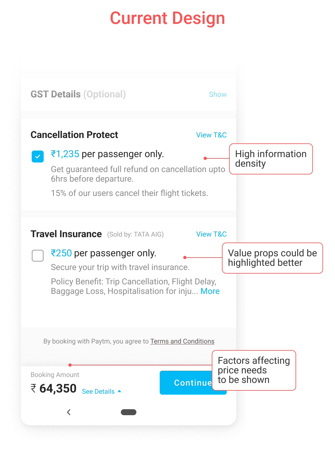
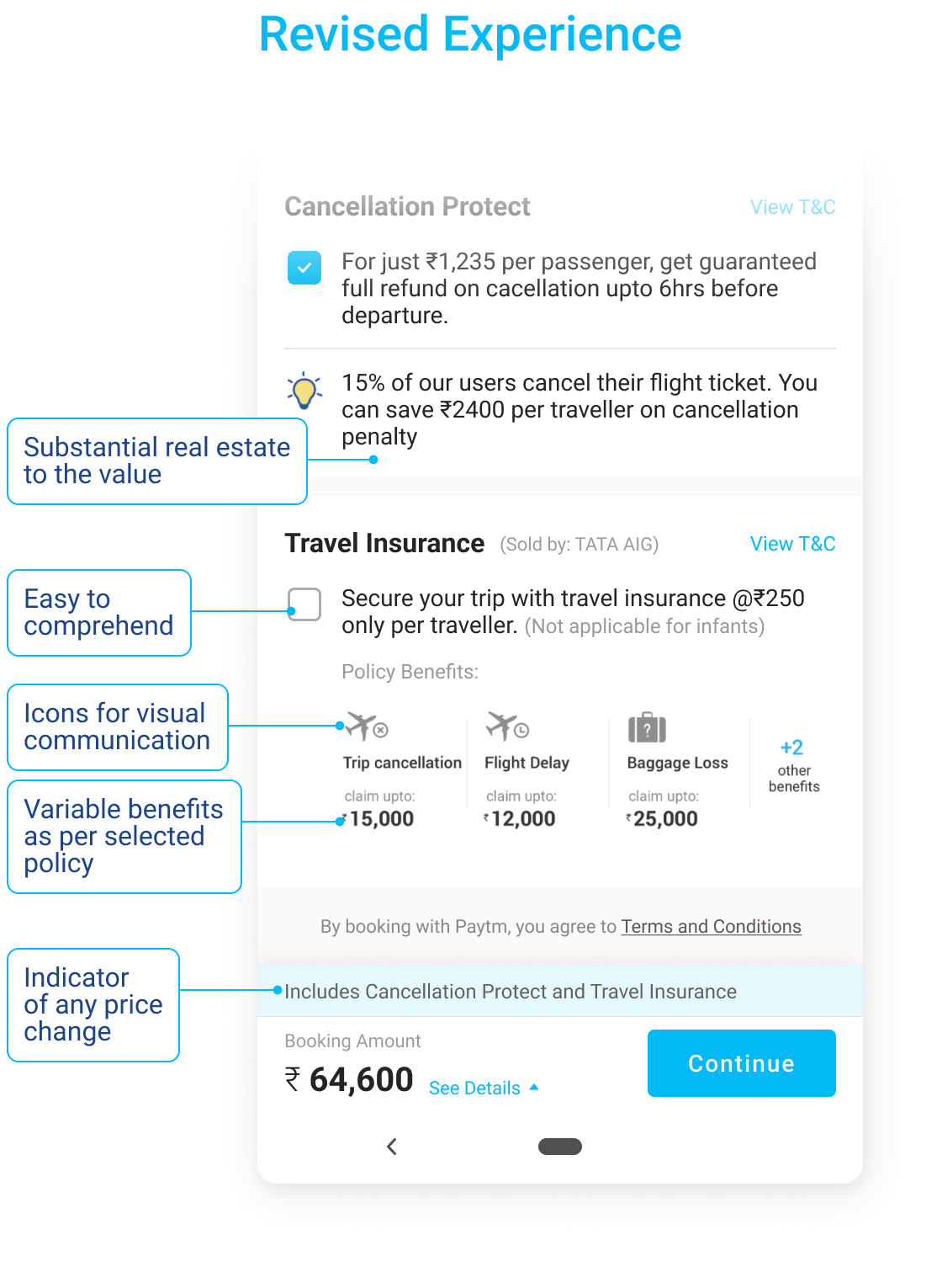
Between 7 and 11% of flight tickets are cancelled or rescheduled, yet only 22% of bookings carried Cancellation Protect. I had to reframe the cover — explain it clearly, offer it at the right moment — so more travellers understood its value and chose it.
A module-level refresh
I lifted traveller information into its own sub-stage, keeping any single screen light and leaving room to flex. From there, I rebuilt each module around one principle: show the primary information first, and let hierarchy do the explaining.
Flight cards
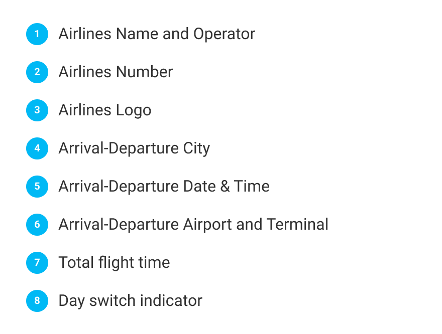
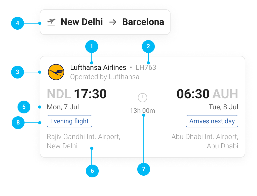
My new card layout leads with the data travellers scan for first. I used weight, colour, spacing and stroke to carry the hierarchy — so the essentials read at a glance, and the detail stays available without crowding.
Quick alerts
Research was clear: alerts land better in real time, at the moment of selection, than buried at checkout. So I surfaced price shifts, regulatory notes and local-law requirements exactly where the decision is being made.
Policy, insurance and offers
Policies are long and unavoidably text-heavy, but I found three answers matter up front: whether a fare is refundable and what a change really costs, how much check-in baggage each traveller gets, and the booking class. Surfacing those first turned fine print into a confident choice.
The screens in motion
My redesigned flow, seen end to end.
What changed
In its first month, travel insurance selection rose by 18%. The extra room I gave it let the benefit explain itself; icons added a small moment of delight; and my minimal cards carried meaning through hierarchy alone. The alerts I moved out of the review page and into the flow simply worked harder — and the feedback from users was blunt in the best way: the designs were spot on.
I learned that dense, high-stakes information becomes effortless when it's broken into the right steps — an itinerary trusted at a glance, and a decision made without a second thought.