Designing Scryon’s AI call experience from first principles
Scryon
Product StrategyUX/UI DesignDesign System
YEAR
2026
PROJECT OVERVIEW
Scryon came to us with an ambitious AI capability spanning recording, transcription, analysis, and action management. We turned that broad requirement into a clear, trustworthy mobile experience.
Owl led product strategy, information architecture, UX/UI, prototyping, and the design system—creating a coherent Android product and a reusable foundation for future releases.
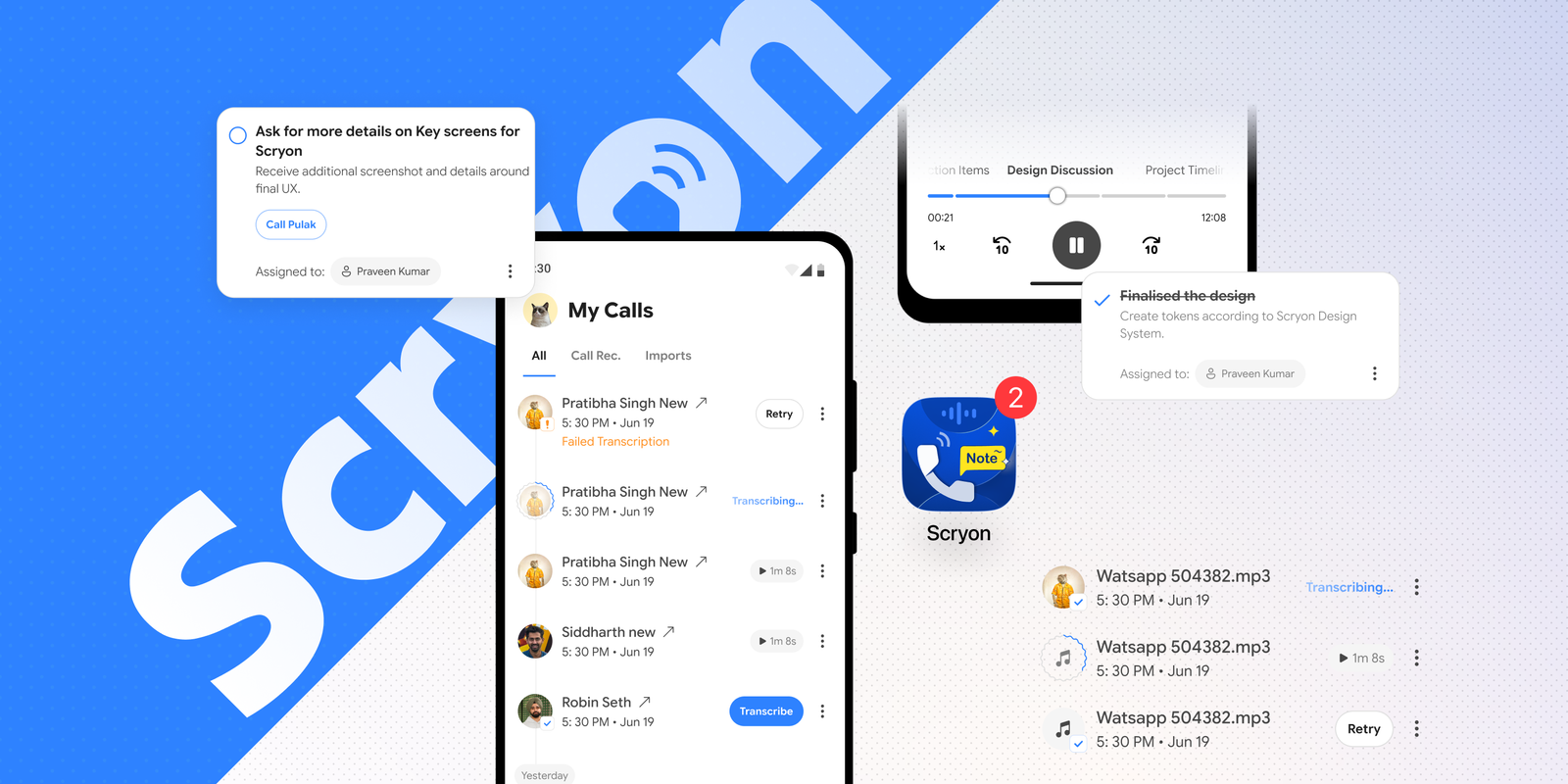
Branding — making an invisible AI service feel tangible
Before shaping the product flows, we gave Scryon a recognisable identity. Competitive analysis showed a category crowded with literal phone symbols and generic AI cues, so the system needed to feel immediate without becoming interchangeable.
The wordmark turns the ‘o’ into a compact call-and-signal symbol. That idea carries into an app icon that combines calling, audio, notes, and notification—making the product’s promise visible before a user opens it.
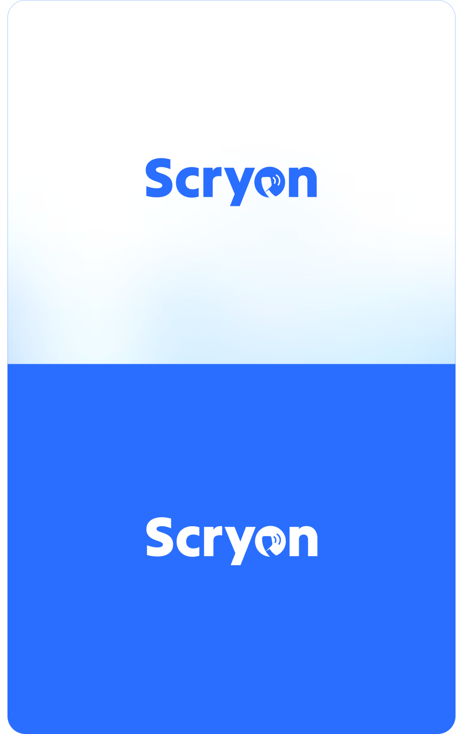

A visual system designed for light and dark
The palette is anchored by confident blues, supported by yellow and pink accents for emphasis and status. A broader blue and violet ramp keeps the interface expressive while maintaining continuity across light and dark surfaces.
We compared Google Sans and Open Sans to establish a clear, approachable typographic voice. The resulting direction balances a distinctive display presence with highly legible product copy for dense call information.
Shared Colours / Semantic Colours
Type Ramp
App Header
24 / 29 · Bold · +0.24Turn every call into clarity.
Sub Header
20 / 24 · Medium · +0.20Summary, outcome, next steps.
Body 1
16 / 22 · Medium · +0.16A transcript is useful. A transcript that knows what happens next is better.
Body 2
14 / 20 · Regular · +0.14Vartika Singh · 5:30 PM · Jun 19
Body 3
12 / 14 · Regular · +0.12Assigned to Praveen Kumar
Discovery — separating the product need from the feature list
The initial requirement described many capabilities, but not yet a single product behaviour. We audited each requirement against the user’s real sequence: finding a call, deciding whether to process it, checking the result, and following through.
That analysis helped us distinguish primary jobs from supporting controls. Recording and retrieval became the entry point; AI processing became a visible system state; summaries and actions became the output. Everything else was organised around that spine.
Product strategy — one mental model across the app
We reduced the experience to three user-owned stages: Calls, Transcribed, and Actions. This gave the navigation an immediately understandable logic and stopped the AI layer from becoming a separate destination with its own vocabulary.
The model also gave every new requirement a home. Inputs belong to Calls, interpreted output belongs to Transcribed, and follow-through belongs to Actions. That structure made the experience easier to learn and the roadmap easier to extend.
Call recording & import — designing a confident starting point
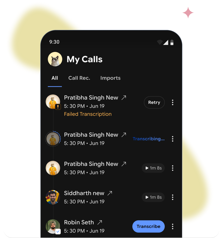
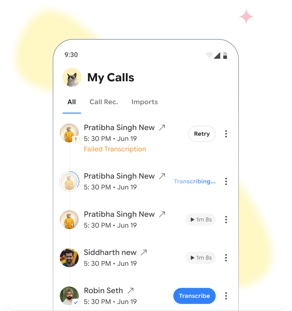
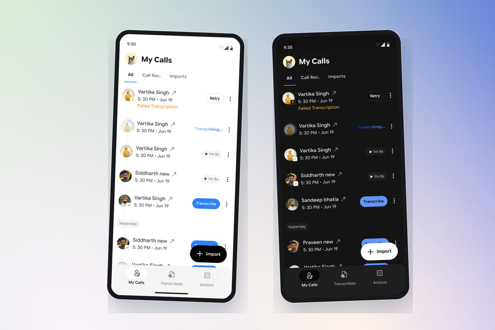
The call list had to accommodate recordings made in the app, existing phone recordings, and manually imported audio without making those sources feel like separate products. We designed one consistent list, then used filters and metadata to preserve source context.
Primary actions stay close to the item that needs them. Ready files can be transcribed, failed files can be retried, and active processing remains visible without blocking the rest of the library.
Transcription — designing the states between request and result
AI processing is asynchronous, so the experience could not be designed as a simple before-and-after screen. We mapped the full state model: available, selected, uploading, transcribing, ready, failed, retried, and completed.
Each state received a distinct visual treatment and an appropriate next action. This reduced ambiguity, made failure recoverable at the point of need, and let users continue browsing while work happened in the background.
Analysis — turning output into a decision hierarchy
We did not treat the transcript as the product’s hero. The analysis view leads with the call identity, summary, outcome, detailed discussion, and related actions; verbatim transcription remains available as evidence.
Progressive disclosure keeps the first read short while preserving depth for verification. The audio player and transcript stay connected to the analysis, so a user can validate an insight without leaving the context that produced it.
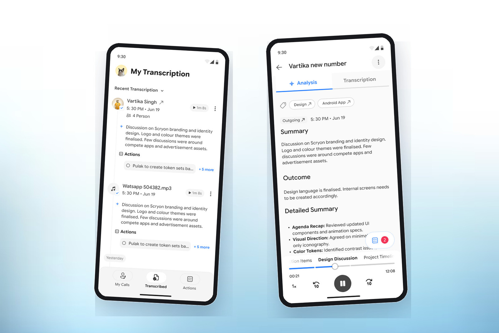
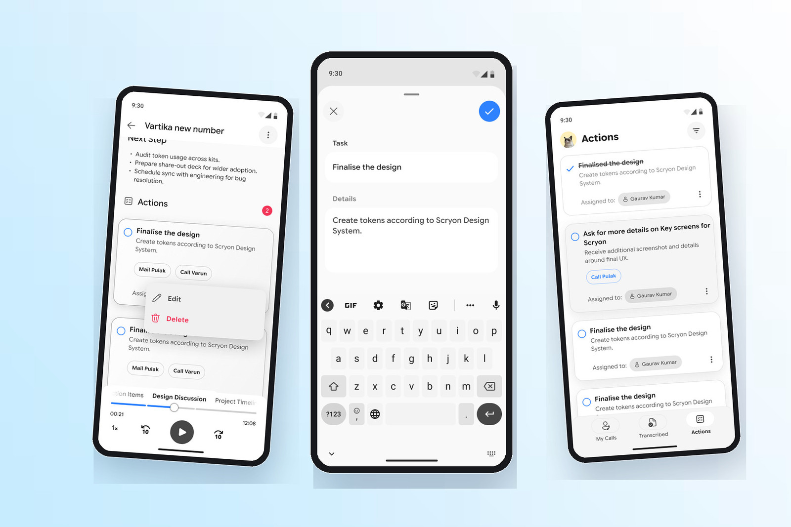
Actions — carrying context into the next step
The requirement included action extraction, but a detached task list would have removed the value of the conversation. We kept every action linked to its call, participant, owner, and supporting detail.
We designed actions to work at three levels: visible inside the analysis, editable in context, and manageable as a focused list. Contextual options such as call or email turn the output into an immediate next move rather than a passive reminder.
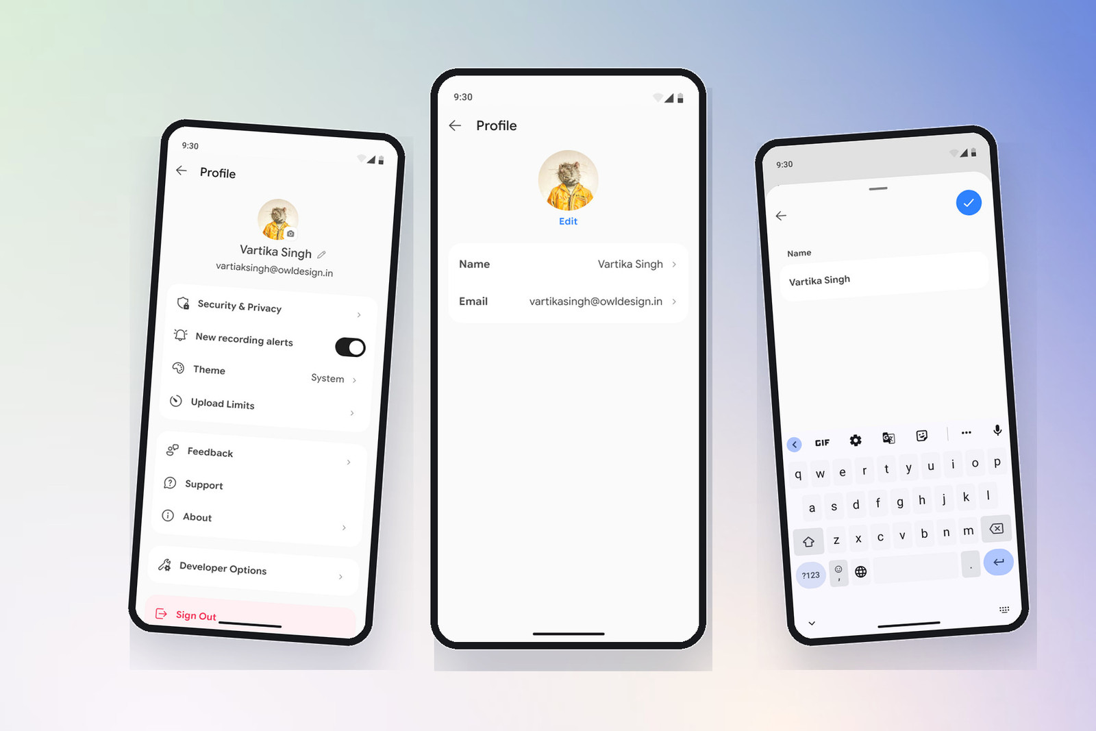
Settings, profile & privacy — making control part of the experience
Call data is personal, so trust could not live only in policy copy. We grouped security, recording alerts, upload limits, theme, account details, feedback, and support into a profile structure that makes control easy to find.
Sensitive and destructive actions receive clear separation, while routine preferences stay lightweight. Edit flows use focused sheets and explicit confirmation to reduce accidental change without making account management feel heavy.
Design system — scaling decisions beyond the first release
Once the core flows were resolved, we converted the visual language into a reusable system. Semantic tokens cover brand, surface, text, stroke, feedback, and interaction roles across light and dark themes. Type, spacing, radius, elevation, and icon rules give dense information a consistent rhythm.
We defined reusable patterns for call rows, processing states, tabs, action cards, buttons, fields, sheets, filters, navigation, and empty or error states. The system lets the product team assemble new screens from established decisions instead of redesigning common behaviour.
Documentation connected each component to its usage, state logic, and accessibility intent—making the handoff useful for both design and engineering.
Design impact
One clear product model
Recording, transcription, analysis, and actions now follow one predictable flow.
Trust in every state
Progress, failure, retry, and privacy controls make AI behaviour visible and recoverable.
Ready to scale
Reusable tokens and components reduce rework as the product grows.
We transformed a capability-heavy requirement into a product people can understand, trust, and extend.